
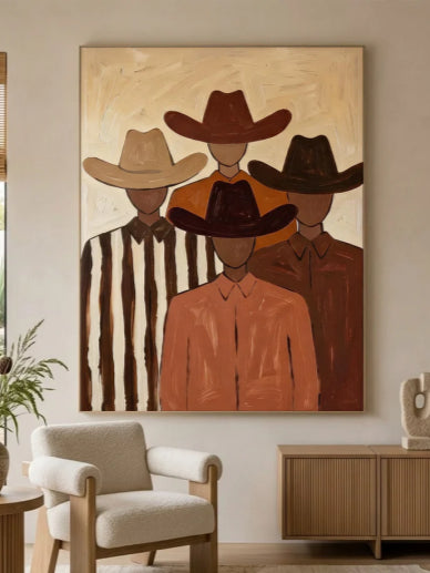
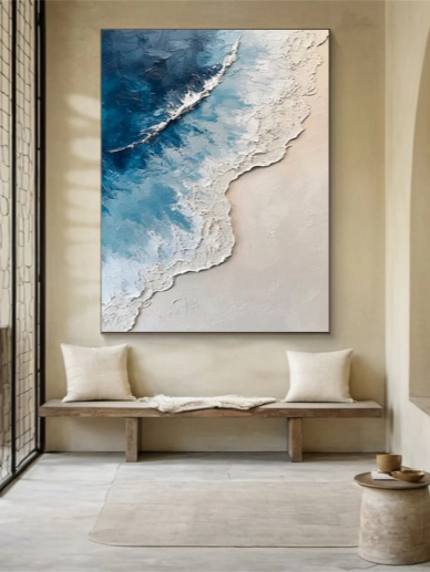



Mixing different frames can make a gallery wall feel more personal and collected. But if the colors, sizes, and styles are all different, the wall can quickly look messy.
The trick is not to make every frame match. Instead, create a few visual connections between them. Here are some simple ways to mix and match frames without making your gallery wall feel chaotic.
How to Mix and Match Frames for a Gallery Wall
1. Stick to Two or Three Frame Colors
You do not need to use the same frame color throughout your gallery wall. Black, natural wood, white, and gold can all work together when they are used intentionally.
Try choosing two or three main colors and repeating them throughout the arrangement. For example, mostly black frames with a few natural wood frames can create contrast while still feeling cohesive.
If your artwork is already colorful, neutral frames can help keep the overall look balanced.

2. Mix Frame Materials and Styles
Different materials can add depth to a gallery wall. Try combining wood, metal, painted frames, or simple acrylic frames.
You can also mix modern and vintage-looking frames. The important thing is to give them something in common, such as color, artwork style, or finish.
3. Combine Different Sizes
Using frames in different sizes usually makes a gallery wall more interesting than using identical frames.
Start with one larger piece as an anchor, then place medium and smaller pieces around it. This gives the arrangement a clear focal point and prevents every artwork from competing for attention.
Avoid filling a large wall with too many tiny frames. A few larger pieces can often create more visual impact while making the arrangement easier to balance.

4. Mix the Artwork, Not Just the Frames
You can create variety by mixing different types of artwork as well as different frames.
Try combining photographs, illustrations, paintings, abstract artwork, vintage prints, or textured wall art. You can even include a small mirror or woven piece for a different texture.
If the frames are quite different, keep the artwork connected through a similar color palette, subject, or overall mood. This creates a visual thread that ties the gallery wall together.
5. Keep the Spacing Consistent
Consistent spacing can make a bigger difference than perfectly matching frames.
As a starting point, leave about 2 to 4 inches between pieces. The exact distance can change depending on the size of your wall and artwork, but try to keep the gaps relatively consistent.
You can also align certain edges, such as the top or bottom of two frames. This adds structure without forcing the entire gallery wall into a rigid grid.

6. Plan the Layout Before Hanging
One of the easiest ways to avoid mistakes is to plan the arrangement before putting anything on the wall.
Lay your frames and artwork on the floor and try several layouts. You can also cut paper templates to the size of each frame and tape them to the wall.
Start with the largest piece, then build the arrangement around it. Move smaller pieces around until the visual weight feels balanced.
This also makes it easier to create an asymmetrical layout without making it look random.
7. Use Matting to Connect Different Frames
Matting can help different frames feel more cohesive, especially when you are mixing photographs, prints, and artwork.
A white or off-white mat creates breathing room around the artwork and can make frames with different colors or thicknesses feel more connected.
It is also a useful way to make a small artwork work inside a larger frame without looking lost.

8. Mix New and Vintage-Looking Frames
A gallery wall does not have to come from one collection or decorating style.
You can combine modern frames with vintage-looking frames to create a more collected appearance. For example, a simple black frame can sit next to an aged wood frame or an antique-style gold frame.
To keep the combination from feeling random, connect the pieces through artwork colors, subject matter, or repeated frame finishes.
This approach works particularly well in eclectic, traditional, and relaxed interiors.
9. Match the Frames to the Room
Think about the room as a whole before choosing your frames.
In a modern space, simple black, white, or thin metal frames may work well. In a warm or rustic room, natural wood frames can complement the existing furniture and materials.
For a more traditional space, decorative wood or metallic frames can add character.
You do not have to match the frames exactly to your furniture. Instead, look for materials and colors that naturally fit into the room.
10. Pay Attention to Frame Thickness
Frame color is not the only thing that affects how a gallery wall looks. The thickness of each frame also matters.
A combination of thin and medium-width frames can add subtle variation without making the wall feel chaotic. If you have one particularly thick or decorative frame, consider using it as a focal point rather than surrounding it with several equally heavy frames.
When mixing frame thicknesses, balance is more important than perfect symmetry.

A Simple Formula for Mixing Gallery Wall Frames
If you are not sure where to start, try this formula:
1 large anchor piece + 2–3 frame colors + different frame sizes + consistent spacing + one common element.
For example, combine a large abstract or textured artwork with several smaller photographs or prints. Use mostly black and natural wood frames, keep the spacing around 2–4 inches, and repeat one element such as a white mat or similar color palette.
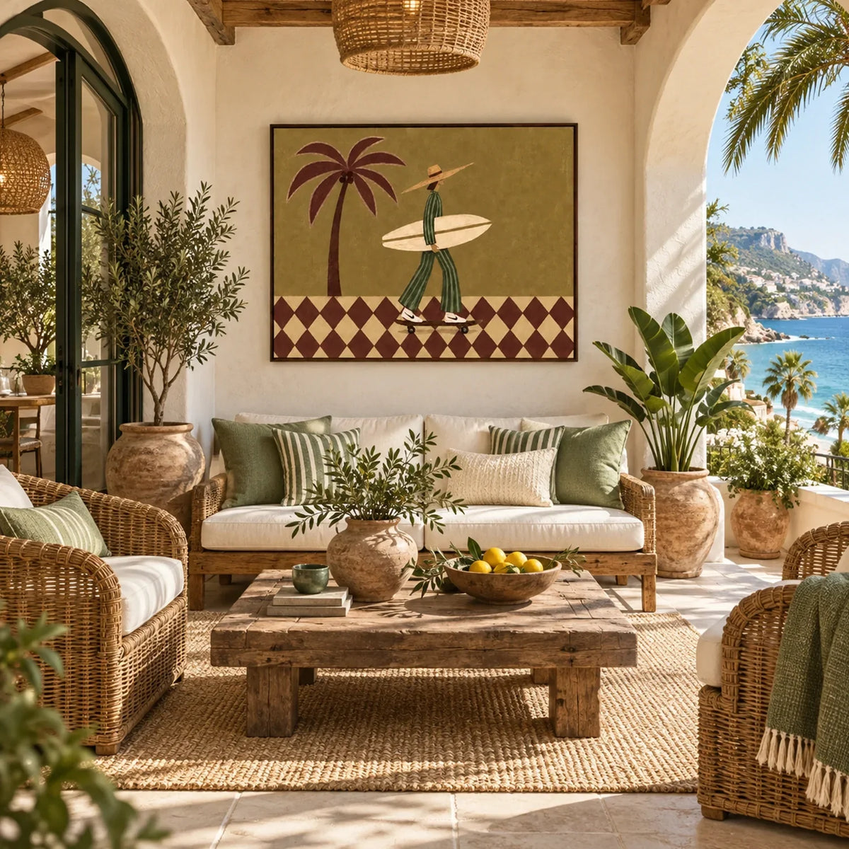
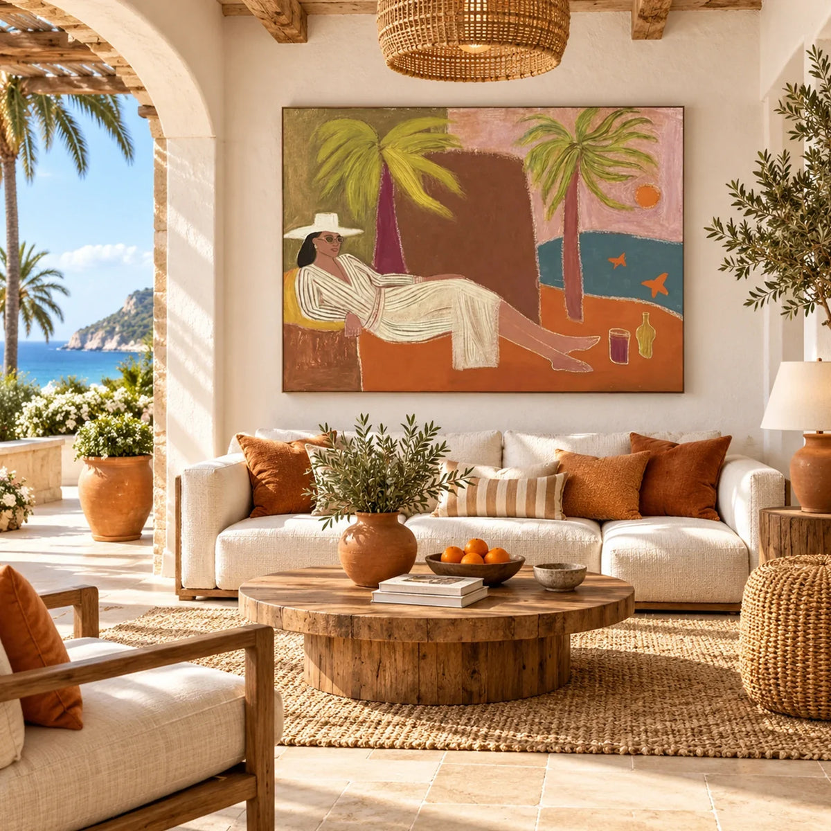
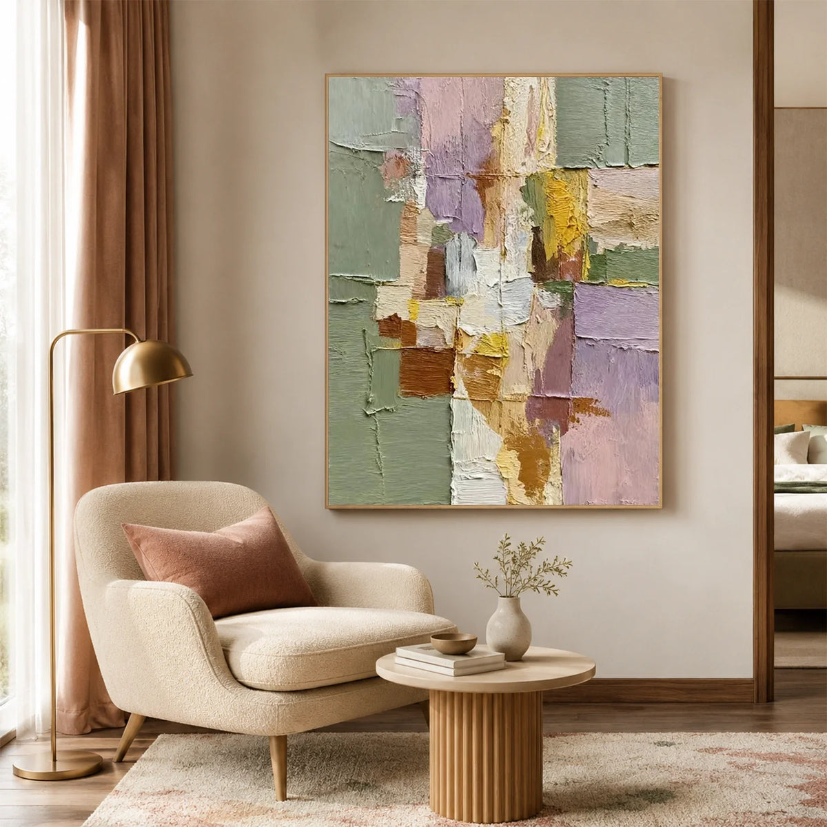
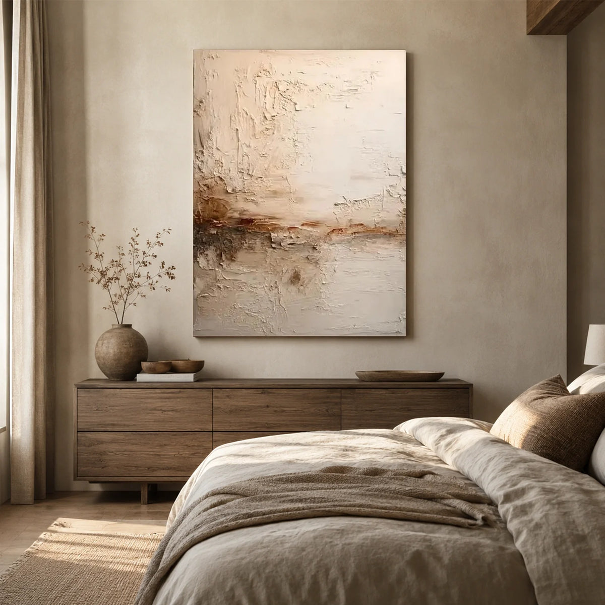
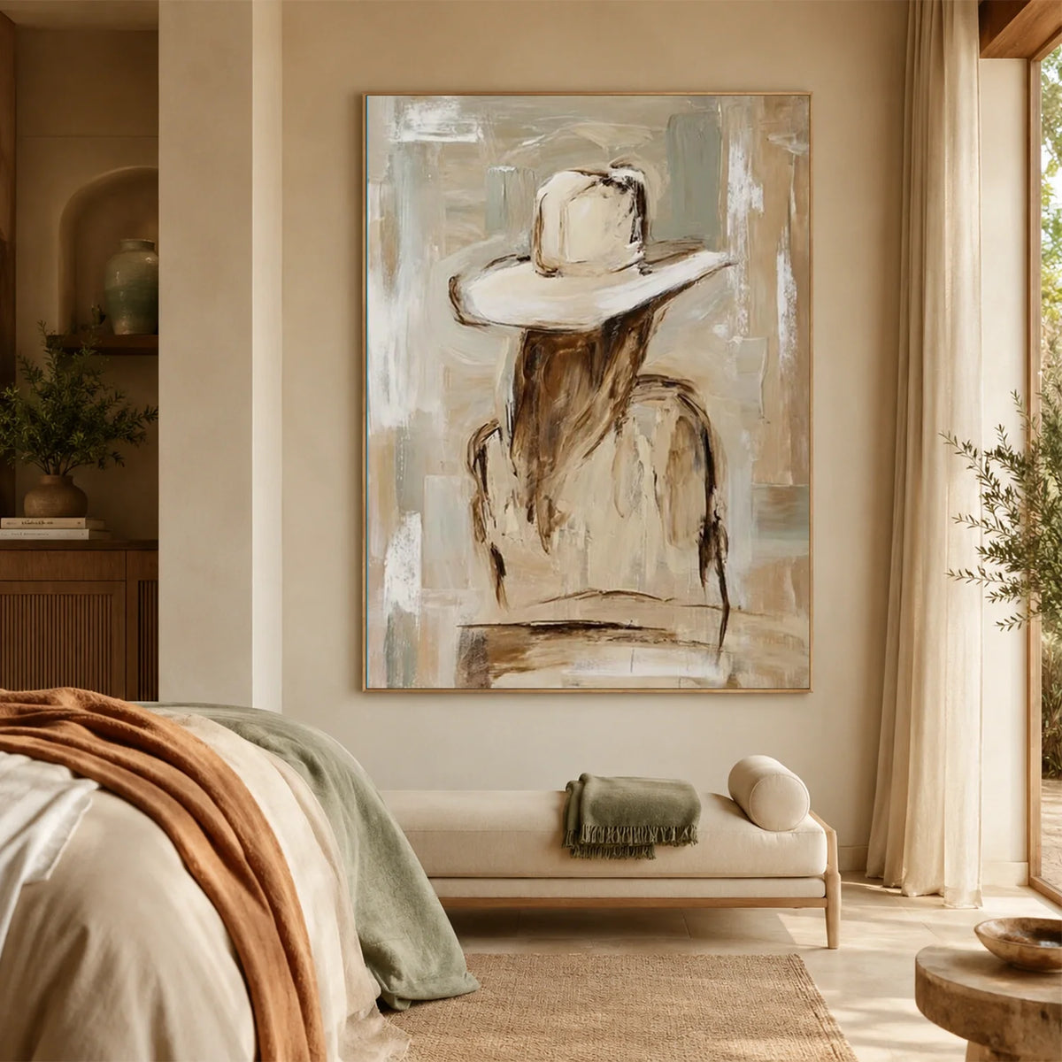
For large wall art with more texture and character, Eleanos Gallery offers handcrafted abstract, minimalist, and textured pieces that can work as a focal point within a gallery wall.
Gallery Wall Layouts That Work With Mixed Frames
Mixed frames can work with almost any gallery wall layout. The key is to keep some elements consistent, such as spacing, alignment, or color.
Grid Layout
Arrange frames in neat rows and columns for a clean, structured look. Different frame colors and sizes can still work as long as the spacing stays consistent.
Symmetrical Layout
Balance different frames by their visual weight rather than making both sides identical. A large dark frame, for example, can be balanced by several smaller frames.
Organic Layout
Mix different sizes, shapes, and frame styles for a more relaxed, collected look. Repeating one or two colors can help tie the arrangement together.
Centered Layout
Start with one larger or more eye-catching piece in the center, then place smaller frames around it. This works especially well when you want one artwork to be the focal point.
Before hanging anything, lay the frames on the floor or use paper templates on the wall to test the arrangement and spacing.
Common Mistakes When Mixing Gallery Wall Frames
Mixing frames gives you more freedom, but there are a few mistakes worth avoiding.
Using too many different frame styles
Variety is useful, but every frame does not need to be completely different. Repeating a few elements will make the arrangement feel more cohesive.
Ignoring the artwork
Frames should support the artwork rather than compete with it. If the artwork is colorful or detailed, simpler frames may work better.
Making everything perfectly symmetrical
A gallery wall can be balanced without being symmetrical. Slight variations in size and placement often make the arrangement feel more natural.
Using inconsistent spacing
Different frame sizes are fine, but random spacing can make the entire arrangement look unfinished.
Choosing frames without considering the room
A frame that looks great on its own may not work with the colors, furniture, and overall style of the space.
FAQ
Do all the frames on a gallery wall need to match?
No. Mixing different frame colors, materials, and styles can make a gallery wall feel more personal. The key is to keep at least one element consistent, such as color, spacing, or artwork style.
How many different frame colors should I use on a gallery wall?
Two or three frame colors are usually enough to create variety without making the wall look too busy. Black, natural wood, white, and gold are versatile choices.
Can you mix black and wood frames on a gallery wall?
Yes. Black and natural wood frames create a balanced combination of contrast and warmth. Repeat both colors throughout the arrangement rather than grouping each color on one side.
How far apart should frames be on a gallery wall?
A gap of about 2 to 4 inches between frames is a good starting point. The exact spacing depends on the size of the artwork and the wall, but keeping the gaps relatively consistent helps the arrangement feel cohesive.
Final Thoughts
Mixing and matching frames is less about following a strict formula and more about finding a balance between variety and repetition.
Choose a few frame colors or materials, mix different sizes, and use the artwork to create visual connections. Repeating certain elements, such as a frame color, mat color, or finish, can help the entire gallery wall feel intentional.
Most importantly, give yourself time to experiment before hanging the pieces. A gallery wall should feel collected and personal, not like every frame came from the same set.




Leave a comment
This site is protected by hCaptcha and the hCaptcha Privacy Policy and Terms of Service apply.