
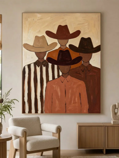
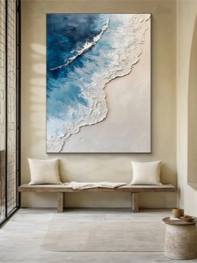
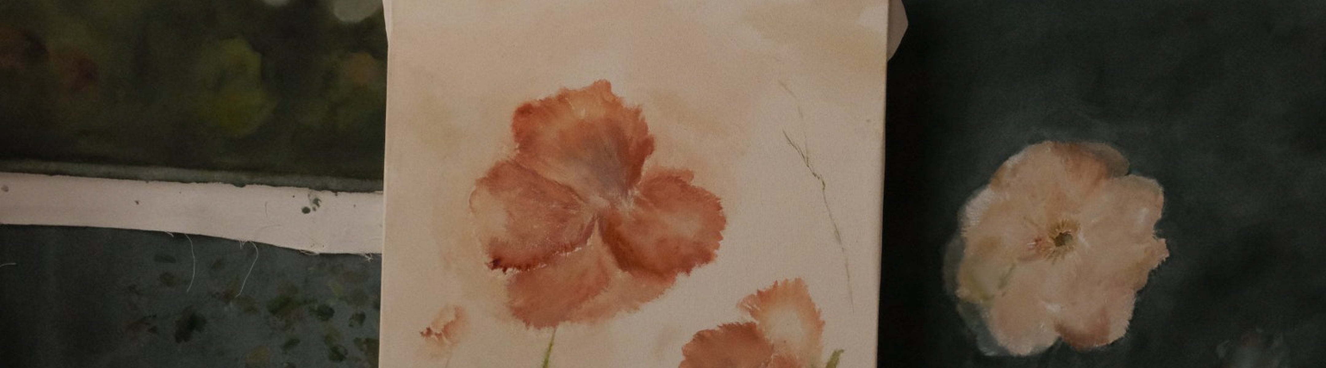


Decorating a room can feel overwhelming when you are trying to choose colors, furniture, and accessories that work well together. One simple method that many interior designers use is the 70/20/10 rule in decorating.
This design rule helps create a balanced and visually appealing space by dividing colors into three proportions: 70% dominant color, 20% secondary color, and 10% accent color.
Whether you are designing a living room, bedroom, or any other area in your home, the 70/20/10 rule can help you create a space that feels coordinated without looking boring.
What Is the 70/20/10 Rule in Decorating?
The 70/20/10 decorating rule is a guideline for combining colors in an interior space. It suggests that:
- 70% of the room should use the main color
- 20% should use a complementary secondary color
- 10% should be reserved for accent colors
The goal is to create a natural visual hierarchy. Instead of using too many colors equally, this method gives each color a specific role, making the room feel more balanced and intentional.
For example, in a living room:
- 70% could be warm white walls, a neutral sofa, and a large rug.
- 20% could be wooden furniture or a darker-colored chair.
- 10% could be decorative pillows, artwork, or accessories in a bold color.
This creates a layered look while preventing the space from feeling chaotic.

How to Apply the Rule in Your Own Home
Ready to try it out? Here’s a simple step-by-step guide to get you started :
1. Start with a Mood
Before you pick any colors or pieces, think about how you want the room to feel. Calm and serene? Bold and energetic? Elegant and sophisticated? This will guide your choices for each layer of the rule.
2. Select Your Dominant Color (The 70%)
Choose a color that aligns with your desired mood. Usually, this is a neutral or subtle tone like soft gray, warm beige, or creamy white . Apply this to your walls and largest pieces of furniture. This is your canvas.
3. Add Your Secondary Color (The 20%)
Now, choose a color that complements your dominant hue. This is your chance to add contrast and richness. A deeper tone like charcoal, navy, or sage green works well here . Use it for items like accent chairs, curtains, area rugs, or an upholstered headboard.
4. Bring in Your Accent Color (The 10%)
This is your wildcard. Pick a bold, vibrant color that you love, such as mustard yellow, terracotta, or a brilliant teal . Use it sparingly on items like throw pillows, artwork, ceramics, or a decorative tray. The goal is to create small moments of surprise, not overwhelm the space.
How to Choose Colors Using the 70/20/10 Rule
Applying the 70/20/10 rule is easier than it sounds. Instead of picking random colors you like, build your palette one step at a time, starting with the largest elements in the room and working toward the smallest details.
1. Start With Your Dominant Color
Your dominant color sets the overall mood of the room, so choose it first. Since it will cover about 70% of the space, think about the atmosphere you want to create before selecting a shade.
For a calm and relaxing space, soft neutrals like warm white, light gray, or beige are timeless choices. If you prefer a more natural feel, earthy tones such as sage green, warm brown, or sand create a cozy, organic look. For a bolder, more dramatic interior, deeper colors like charcoal, navy, or forest green can make a strong statement while still feeling sophisticated.
2. Add a Complementary Secondary Color
Once you've chosen your main color, select a secondary color that complements it rather than competes with it. This color should add contrast and depth while keeping the overall palette cohesive.
For example, beige pairs beautifully with brown and black accents, white works naturally with wood tones and soft greens, while gray can be enhanced with muted blues and touches of gold. The key is to choose colors with similar undertones so they blend together naturally instead of feeling disconnected.
3. Finish With an Accent Color
The final 10% is where you can add personality to the room. Accent colors are meant to draw the eye, so they work best when used sparingly and repeated in a few different places.
For instance, if black is your accent color, you might incorporate it through picture frames, lighting fixtures, decorative objects, or even a piece of wall art. Repeating the same accent color throughout the room helps tie different elements together, making the space feel intentional and well-designed rather than random.

Does the 70/20/10 Rule Only Apply to Colors?
Not at all. While the 70/20/10 rule is most commonly used for color schemes, the same principle can also be applied to other decorating elements. Thinking in proportions rather than exact percentages can help create a space that feels balanced, layered, and visually cohesive.
Using the Rule for Texture
Texture plays an important role in making a room feel warm and inviting. Instead of relying on color alone, you can use the 70/20/10 rule to mix different materials.
For example, around 70% of the room could feature smooth, simple surfaces like painted walls, upholstered furniture, and sleek flooring. Another 20% could introduce natural textures such as wood, linen, or rattan, while the remaining 10%can be reserved for statement pieces like handcrafted textured wall art, a woven pendant light, or a sculptural vase. This combination adds depth and character without overwhelming the space.
Using the Rule for Patterns
The 70/20/10 rule can also help when mixing patterns. A good approach is to let 70% of the room feature solid colors, 20% include subtle patterns like striped cushions or a lightly patterned rug, and 10% showcase bolder prints through artwork, throw pillows, or decorative accessories.
By limiting bold patterns to a small portion of the room, you create visual interest while keeping the overall design clean, balanced, and easy on the eyes.
Example of Using the 70/20/10 Rule
Here are three practical, real-world examples of how to apply the 70/20/10 rule across different rooms and style preferences.
1. The Serene Living Room
This combination creates a calming, organic, and modern oasis. It relies on natural textures to keep the dominant neutral base from looking flat.
-
70% Dominant Base (Warm Cream): Painted walls, a large linen sectional sofa, and a cream bouclé area rug.
-
20% Secondary Layer (Olive Green): Velvet accent chairs, floor-to-ceiling olive linen curtains, and a matching olive green blanket draped over the sofa.
-
10% Accent Pop (Brushed Brass & Matte Black): A brass coffee table frame, a matte black reading lamp, and a few graphic black-and-white throw pillows.

2. The Moody Dining Room
If you love dark, dramatic spaces, the 70% does not have to be light. It just needs to be the dominant backdrop.
-
70% Dominant Base (Charcoal Grey): Deep charcoal grey walls, matching charcoal dining chairs, and a large slate-grey minimalist rug.
-
20% Secondary Layer (Warm Walnut Wood): A large, rich walnut dining table, wood flooring, and a walnut sideboard/credenza.
-
10% Accent Pop (Burnt Orange & Gold): Burnt orange linen napkins, an abstract canvas painting featuring warm rust tones, and a striking gold chandelier hanging above the table.

3. The Eclectic Bedroom
This example shows how to use the rule to mix decor styles instead of just paint colors, ensuring a curated look rather than a cluttered one.
-
70% Main Style (Modern Minimalist): A clean, low-profile platform bed, solid white bedding, neutral beige walls, and sleek, handle-less wardrobe doors.
-
20% Secondary Style (Mid-Century Modern): Tapered-leg walnut nightstands, a classic retro starburst clock on the wall, and a leather bench at the foot of the bed.
-
10% Accent Style (Boho Chic): A textured macramé wall hanging, a couple of fringed Moroccan throw pillows, and a small woven rattan basket for plants.

Can You Break the Rule?
Absolutely. The 70/20/10 rule is a fantastic starting point and a reliable guide, but it's not a strict law . Some designers intentionally subvert it for dramatic, maximalist spaces, and others might drop the accent color altogether for a serene, monochromatic look.
However, if you're a beginner or are redesigning a room and feeling unsure, this rule is the best place to start. It gives you a framework for making confident decisions, ensuring your home will always feel balanced and beautiful .
How Wall Art Fits Into the 70/20/10 Decorating Rule
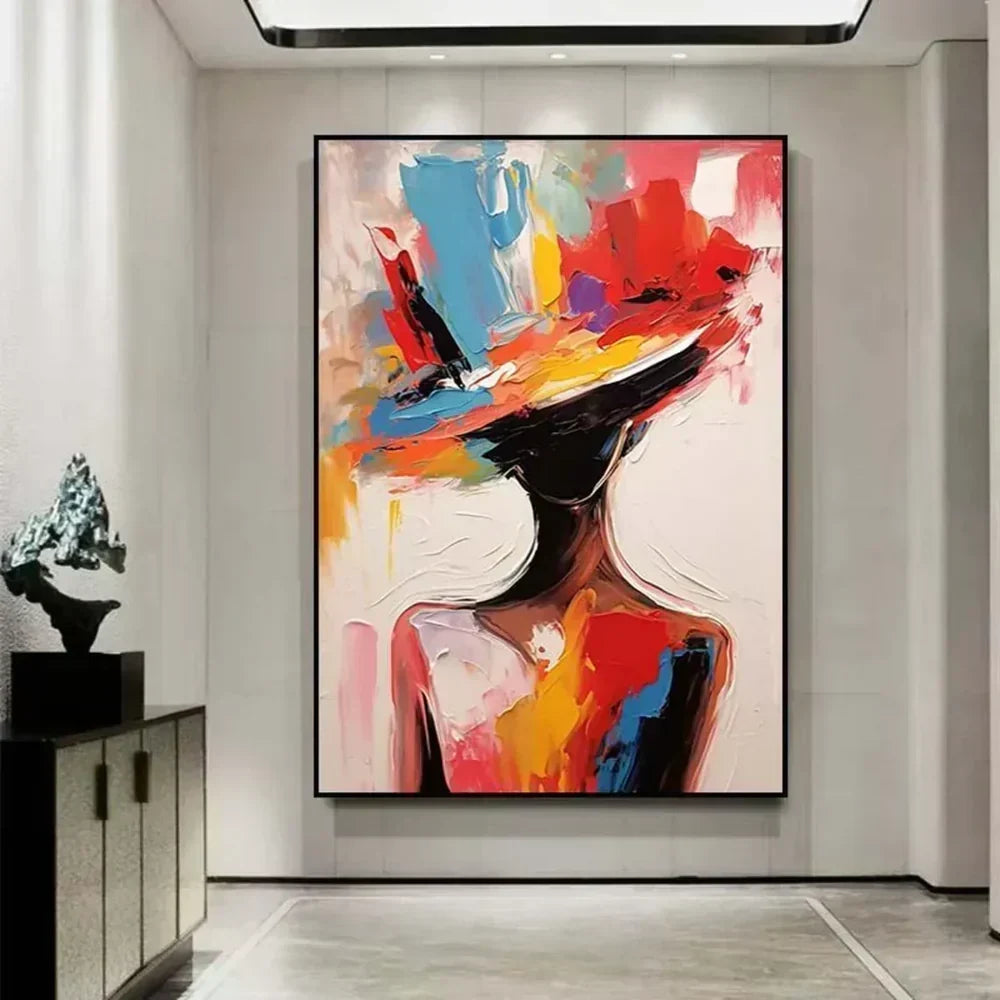
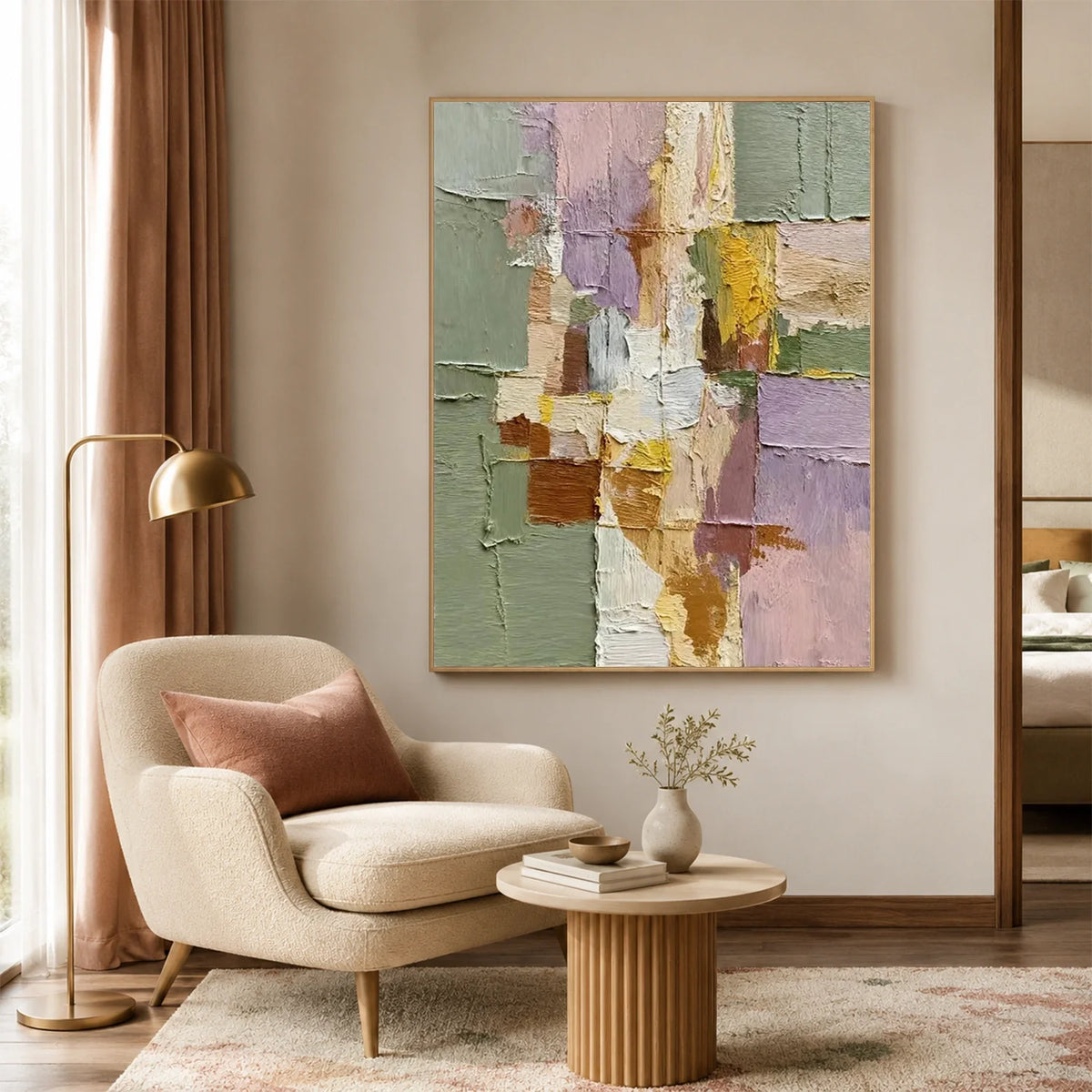
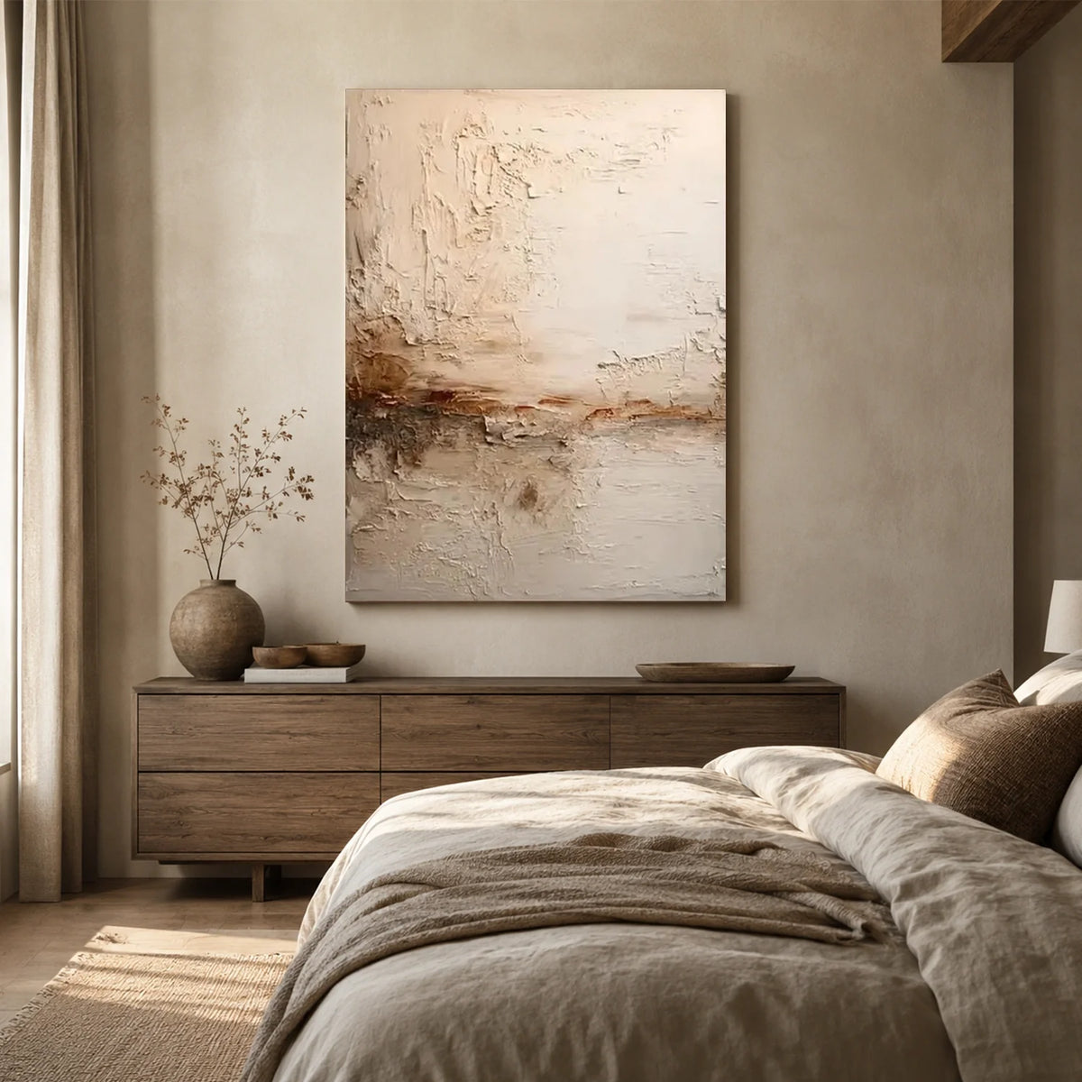
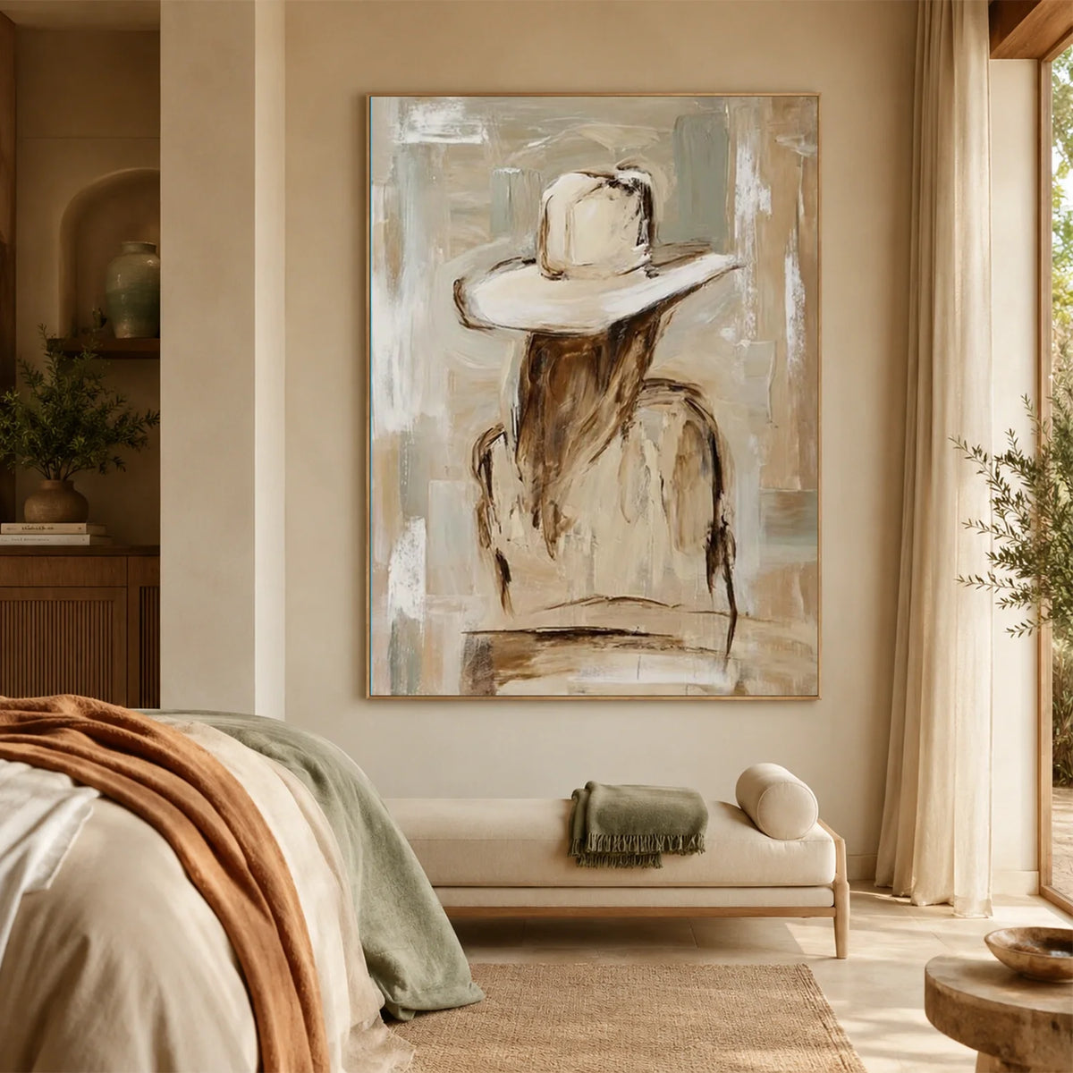
Wall art is often the perfect way to introduce the 10% accent color in a room.
A large abstract painting, textured artwork, or handmade wall piece can become a focal point while adding personality without overwhelming the overall design.
For example, a neutral living room with beige furniture can use a colorful abstract artwork to introduce contrast and create visual interest.
Eleanos Gallery offers handmade textured and minimalist artwork that can help add depth, texture, and an artistic accent to modern interiors.

Common Mistakes to Avoid
The 70/20/10 rule is simple, but it's easy to fall into a few common traps.
Too Many Accent Colors
Stick to one or two accent colors. Bringing in too many will make the room feel chaotic and defeat the purpose of the rule .
The Secondary Color Overpowering the Dominant
Remember, the secondary color is just that—secondary. It shouldn't compete with your main color for attention .
Forgetting to Repeat Colors
For the rule to work, each color should appear at least a couple of times around the room. A single blue pillow might feel like an afterthought, but a blue pillow on a sofa with a blue vase on a shelf creates a cohesive, thoughtful look .
Ignoring Lighting
Always test your colors in the room where they'll live. The way a color looks in the store will be very different from how it looks in your home's natural and artificial light.
FAQs
Is the 70/20/10 rule a strict decorating rule?
No. The 70/20/10 rule is a guideline rather than a fixed rule. You don't need to measure colors precisely. The idea is simply to give one color the dominant role, support it with a secondary color, and add a small amount of accent color for contrast and personality.
Can I use more than three colors?
Yes. You can include additional shades as long as they fit within the three main color groups. For example, different shades of beige and cream can all count as part of your 70% dominant color, while multiple accent colors can work together if they make up only a small portion of the room.
Does the 70/20/10 rule work with minimalist interiors?
Absolutely. In fact, it's especially effective in minimalist design. A neutral palette can form the 70%, natural wood or soft earthy tones can make up the 20%, and a textured wall art piece or a few carefully chosen accessories can provide the final 10% of visual interest.
What if my room already has bold furniture?
Start with the largest existing piece, such as a colorful sofa or statement cabinet, and treat it as part of your dominant or secondary color. Then choose the remaining colors around it to create a balanced palette rather than introducing more competing shades.
Final Thoughts
The 70/20/10 rule in decorating is a simple framework that makes choosing colors much less intimidating. By using one dominant color as the foundation, a secondary color for depth, and an accent color for visual interest, you can create a room that feels balanced, cohesive, and welcoming.
While the rule isn't meant to be followed perfectly, it provides an excellent starting point for anyone decorating a home. Once you understand the principle, you can confidently adapt it to suit your personal style, whether you prefer modern, minimalist, traditional, or eclectic interiors.





Leave a comment
This site is protected by hCaptcha and the hCaptcha Privacy Policy and Terms of Service apply.