

What colors will define home interiors in 2026? This year, home design is moving toward warmer, richer, and more natural-looking palettes. Cool grays and stark whites are making room for creamy neutrals, earthy browns, muted greens, soft blues, and deeper accent colors.
These shades can add warmth and character without requiring a major makeover. A fresh coat of paint, a new rug, updated curtains, or a statement piece of wall art can change the feel of a room while keeping the rest of your decor intact.
Whether you're planning a full room refresh or simply looking for a few new ideas, the latest interior color trends for 2026 offer plenty of inspiration.
What Are the Biggest Interior Color Trends for 2026?
The biggest shift in 2026 is toward warmth, depth, and natural-looking color. Designers are moving away from overly cool and sterile palettes and using colors that make rooms feel more comfortable and lived-in.
At the same time, neutral colors are not disappearing. Instead, traditional neutrals such as cool gray are being replaced or complemented by warmer shades of cream, beige, taupe, brown, and khaki.
Here are some of the most popular interior colors and combinations to watch in 2026:
- Warm cream
- Earthy beige
- Chocolate brown
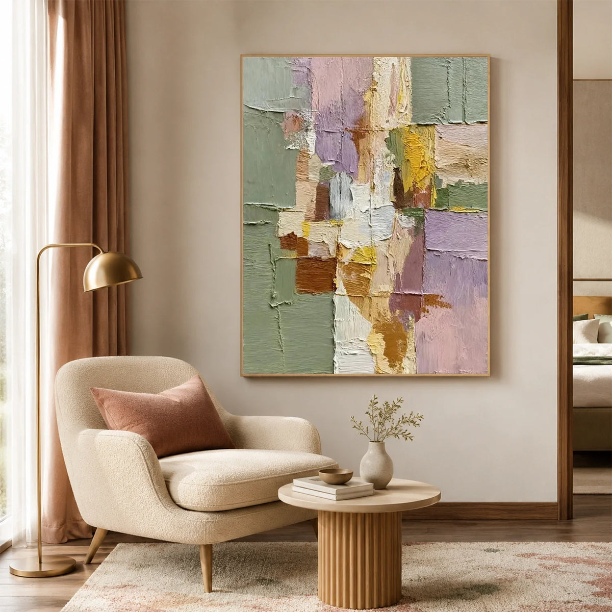
- Sage green
- Olive green
- Blue-green
- Soft blue
- Deep navy
- Terracotta
- Burgundy and rich red
- Dusty pink and mauve
- Color-drenched rooms
Let's take a closer look at each trend.
1. Warm Cream
Warm cream is becoming a popular alternative to stark white.
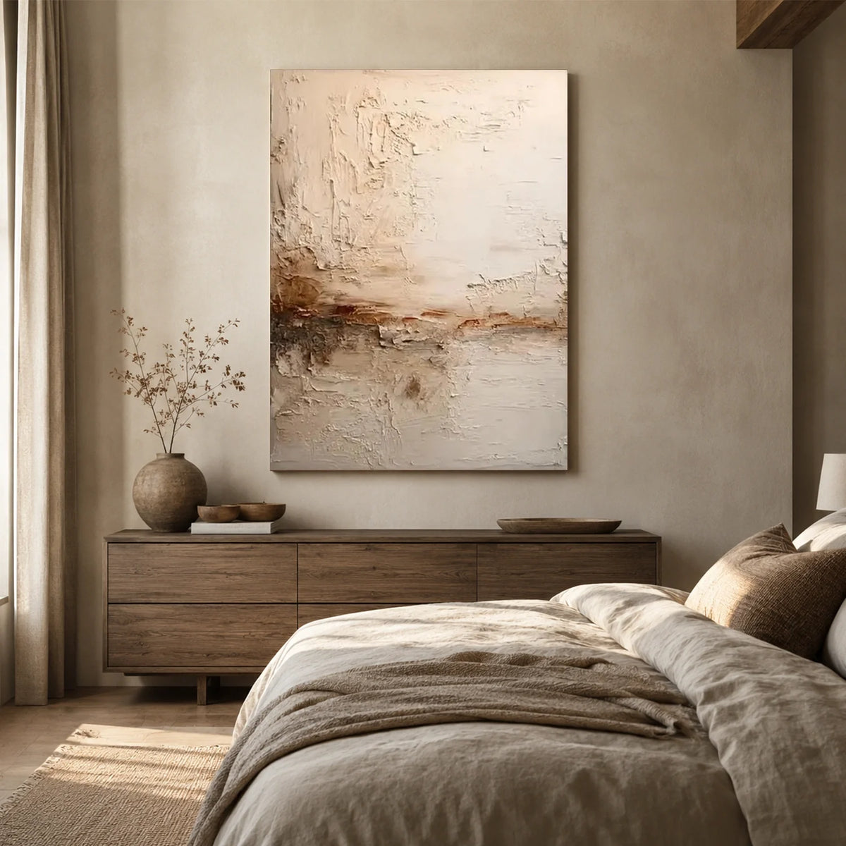
Unlike cool white, cream has subtle warm undertones that can make a room feel softer and more welcoming. It also works well with natural wood, linen, stone, woven materials, and other organic textures.
If you want a neutral home but don't want it to feel cold or overly minimalist, warm cream is an easy place to start.

2. Earthy Beige and Taupe
Beige is making a comeback, but today's beige looks very different from the yellowish beige popular in the past.
Modern beige and taupe tend to have softer, more muted undertones. They create a comfortable backdrop while allowing furniture, artwork, and decorative accessories to stand out.
Designers are also treating subtle greens, blues, and yellows as modern neutrals, showing how much the definition of “neutral” is expanding.

3. Chocolate Brown
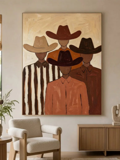
One of the strongest interior color trends for 2026 is the return of rich brown.
Chocolate, espresso, tobacco, and umber tones add depth without feeling as harsh as pure black. Designers are using these colors on walls, cabinetry, furniture, and even ceilings.
Warm brown is particularly effective when combined with natural materials. Think wood furniture, textured fabrics, stone surfaces, and soft lighting.
Benjamin Moore's 2026 Color of the Year, Silhouette AF-655, is a deep blend of burnt umber and charcoal, while PPG selected Warm Mahogany, reinforcing the broader move toward rich, grounded colors.
For a less dramatic approach, use brown through a leather sofa, wooden furniture, textured wall art, or smaller decorative pieces.

4. Sage Green
Sage green continues to be one of the most versatile colors for modern interiors.
Its muted appearance makes it easier to live with than brighter greens, while its natural quality brings a sense of calm and freshness to a room.
5. Olive and Moss Green
If sage feels too light, consider moving toward olive or moss green.
These deeper greens create a more sophisticated and grounded look. They can also work almost like a neutral when paired with other earthy colors.
Olive green looks especially good with brown, cream, brass, and natural wood.
For smaller rooms, you don't necessarily need to paint every wall. An olive-colored accent wall, cabinet, or large piece of furniture can provide enough visual impact.

6. Blue-Green
Blue-green is another color gaining attention in 2026.
It sits between blue and green, giving you the calming quality of blue with some of the natural warmth of green. Designers are particularly interested in muted, nature-inspired versions rather than overly bright turquoise.
Blue-green can work beautifully with light oak, travertine, aged brass, cream, and other natural materials.
7. Soft and Dusty Blue
Not every trending color needs to be dark or dramatic.
Soft blue is another important direction for 2026, especially in rooms where you want a relaxed atmosphere.
Muted blue can add color without overwhelming the rest of the space. It works especially well with warm whites and natural materials.
8. Deep Navy
For homeowners who want something bolder, navy remains a reliable choice.
Deep navy can make a room feel sophisticated and cozy, especially when used in a dining room, home office, bedroom, or built-in cabinetry.
The key is balance. Because navy is relatively dark, combine it with lighter elements such as cream walls, natural wood, warm lighting, or lighter-colored artwork.
Navy can also work as an alternative to black when you want a dramatic accent without making the room feel too harsh.

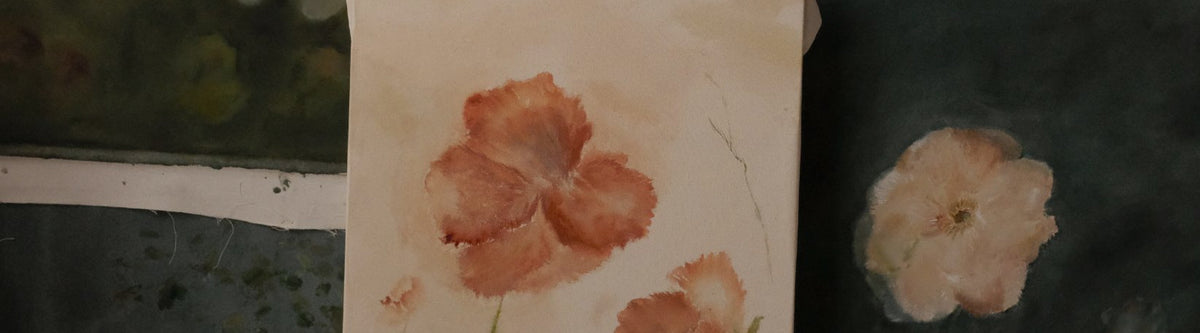
9. Terracotta and Clay
Terracotta is another natural color that fits perfectly with the warmer direction of 2026 interiors.
Its reddish-orange undertones bring warmth and personality while still feeling connected to natural materials.
10. Burgundy and Rich Red
Red is becoming more sophisticated in home interiors.
Instead of bright primary red, designers are turning toward deeper shades such as burgundy, oxblood, wine, and muted brick red.
These colors can make a room feel dramatic and intimate without looking overly bright.
If you're hesitant about painting a wall red, start with smaller elements such as a chair, rug, artwork, or decorative accessories.

11. Dusty Pink and Mauve
Pink is taking a more muted direction in 2026.
Soft dusty pink and mauve can function almost like warm neutrals, especially when paired with brown, cream, beige, or natural wood.
Mauve is also being reconsidered as a sophisticated modern color rather than an outdated one. Its warmer, muted quality makes it surprisingly versatile in bedrooms and living spaces.

12. Color Drenching
Color drenching isn't a specific color, but it is one of the most interesting interior color trends for 2026.
The idea is simple: instead of painting only the walls, use the same or a similar color on the walls, ceiling, trim, doors, and sometimes built-ins.
This creates a more immersive and cohesive look.
Designers are using this technique to create cozy, dramatic spaces, particularly in bedrooms, dining rooms, home offices, and powder rooms.
How to Choose the Right Interior Color for Your Home
Following a color trend doesn't mean you have to copy an entire room from a magazine. The best color depends on your existing furniture, natural light, room size, and personal style.
Consider the Natural Light
A color can look completely different depending on how much natural light a room receives.
Dark rooms may benefit from warm whites, soft creams, or muted colors. A bright, sunny room can handle deeper shades such as olive, navy, or chocolate brown.
Look at Your Existing Furniture
Before choosing a paint color, consider your sofa, flooring, cabinets, curtains, and other large pieces.
If you already have warm wood furniture, earthy green, cream, beige, and brown can create a cohesive palette.
Don't Forget About Undertones
Two colors that look similar on a paint card can look very different on a wall. Pay attention to whether the color has warm, cool, yellow, pink, gray, or green undertones.
Always test a paint sample in the actual room before committing to the entire wall.
Use Color Through Decor
You don't always need paint to follow 2026 home color trends. Wall art, rugs, cushions, curtains, lamps, and furniture can all introduce trending colors without requiring a major renovation.
This is particularly useful if you rent your home or simply like changing your decor regularly.

How to Combine 2026 Interior Colors
The easiest way to create a cohesive color palette is to choose one dominant color, one supporting color, and one or two accent colors.
For example:
Warm and Natural
- Cream
- Olive green
- Chocolate brown
- Natural wood
Soft and Relaxed
- Warm white
- Dusty blue
- Beige
- Light wood
Rich and Dramatic
- Deep navy
- Burgundy
- Cream
- Dark wood
Earthy and Cozy
- Terracotta
- Warm beige
- Olive green
- Chocolate brown
You don't need to use every color equally. Keeping one shade dominant will help the room feel balanced rather than chaotic.
How to Use Wall Art to Complement Interior Color Trends
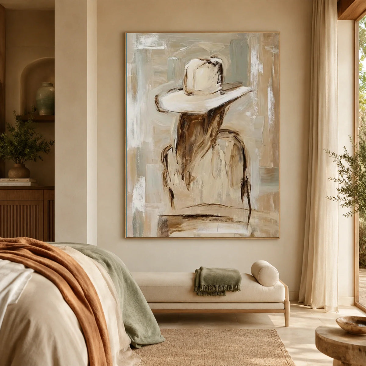
Wall art is an easy way to bring 2026 interior color trends into your home without making major changes. A carefully chosen piece can add color, texture, and personality while complementing your existing decor.
Add Depth to Neutral Spaces
Warm cream, beige, and taupe create a timeless foundation but can sometimes feel too simple. Textured wall art and abstract artwork in earthy tones can add warmth and visual interest to these spaces.
Balance Dark and Bold Colors
Deep shades like navy, forest green, and chocolate brown create a dramatic look but benefit from contrast. Light-toned artwork or minimalist designs can help balance darker walls and create a more cohesive feel.
Introduce Trendy Colors in a Flexible Way
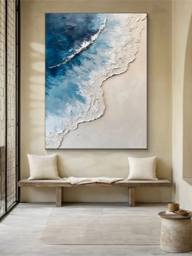
Wall art is also a simple way to experiment with colors like sage green, terracotta, and muted blue. Instead of repainting a room, artwork allows you to refresh your space while keeping your overall design flexible.
Looking for wall art to match your home’s color palette? Eleanos Gallery offers a wide selection of handcrafted wall art in various colors and styles, making it easy to find a piece that complements your interior and adds personality to your space.
 FAQs
FAQs
Is beige coming back in 2026?
Yes. Modern beige is becoming warmer, softer, and more sophisticated, making it a popular alternative to cool gray and stark white.
Is gray still popular for home interiors?
Gray hasn't disappeared, but warmer neutrals and earthy colors are becoming more popular. Warm gray and greige can still work well when combined with wood, cream, and other warm elements.
What is color drenching?
Color drenching means using the same or similar color across multiple surfaces, such as walls, ceiling, trim, doors, and built-ins, to create an immersive and cohesive interior.
Final Thoughts
The biggest interior color trends for 2026 are all about creating spaces that feel warm, comfortable, and personal. From earthy neutrals and natural greens to rich browns and deeper accent colors, these shades can help make a home feel more inviting and full of character.
You don't need to completely redesign your space to embrace these trends. Small updates, such as adding new decor, changing textiles, or introducing a piece of wall art, can make a noticeable difference.
The best color choices are the ones that match your lifestyle and personal style. Use these trends as inspiration, then create a space that feels like home.




Leave a comment
This site is protected by hCaptcha and the hCaptcha Privacy Policy and Terms of Service apply.