

You finally bought that print you’ve been eyeing. You lean it against the wall — and freeze. The room feels... the same. Or worse: slightly off.
Arranging wall art isn’t just about filling empty space—it’s about shaping how your home feels. The difference between a room that looks “put together” and one that feels professionally designed often comes down to how well the wall art is chosen and placed.
In this guide, you’ll learn not only how to arrange wall art, but also how to choose the right pieces, match them to your space, and adapt layouts for different walls in your home.
-
How to choose art that actually fits your space and style
-
Spatial formulas that work every time (no measuring tape anxiety)
-
Room-specific strategies for living rooms, bedrooms, hallways, and beyond
-
5 Common Mistakes to Avoid
How to Choose Wall Art That Fits
Before you even think about arrangement, you need to choose the right pieces. This is where most people go wrong—not because they lack taste, but because they skip the crucial step of considering context. Selecting wall art isn't just about finding something you like; it's about finding something that belongs in your specific space.
Start With Your Home's Existing Style
Every piece of wall art should reinforce your room's character, not compete with it. The goal is harmony, not a random clash of aesthetics.
-
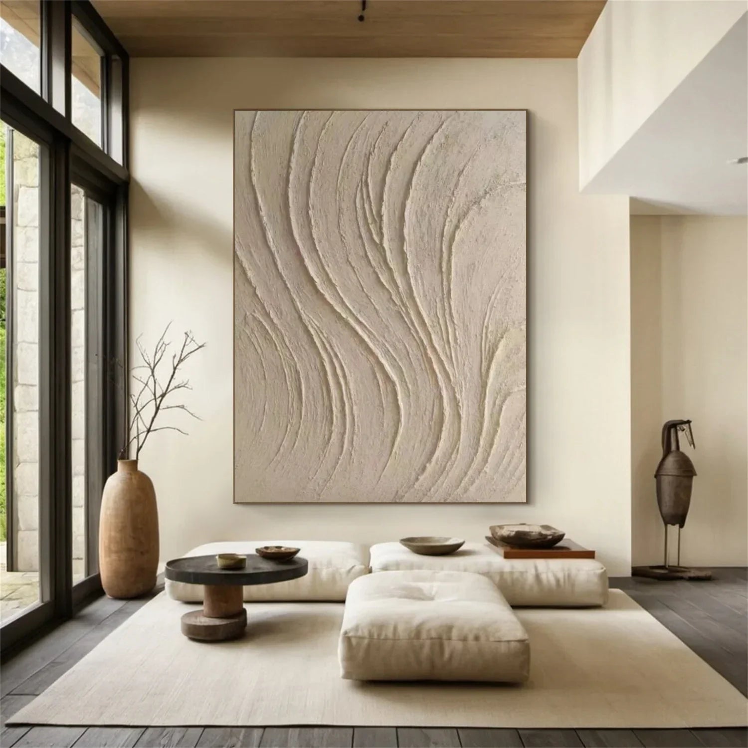
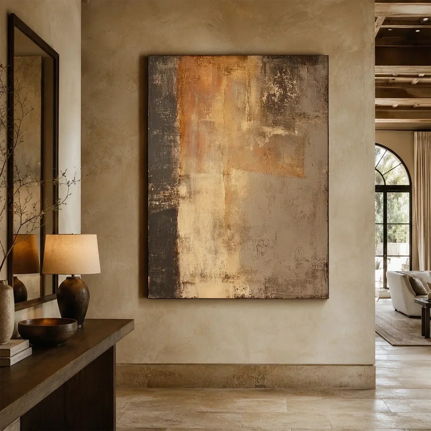
Modern or Minimalist Homes :Look for abstract art, neutral tones, and textured canvases (think linen-weave or matte finishes). Avoid ornate frames.
-
Boho or Natural Spaces :Earth tones, botanical prints, woven wall hangings, and handmade textures like clay or wood work best.
-
Traditional Interiors :Landscapes, classic oil painting reproductions, nautical scenes, or symmetrical compositions with gilded or carved wood frames.
Designers like Joanna Gaines frequently emphasize that art should feel “lived-in” and natural—as if it has a story—rather than overly staged or disconnected from daily life. In her own projects, she often mixes flea market finds with contemporary pieces to create that relaxed, collected-over-time look.

Think in Terms of Scale
One of the most pervasive and damaging mistakes is choosing art that is too small for the wall or the furniture it accompanies. A tiny print floating on a large wall looks unintentional and weakens the entire room.
Bobby Berk (of Queer Eye fame) offers a blunt, memorable rule:“If you think it’s big enough, go bigger.”
To put a more precise rule of thumb on it:
-
Above a sofa, console, or headboard: Aim for the artwork's width to be approximately ⅔ (about 66%) to ¾ (75%) of the furniture's width below it.
-
On a large empty wall: The art should cover 50–70% of the wall's available width to feel intentional.
-
For small pieces: Always group them together (a gallery wall or a diptych/triptych). Never let a single small piece float alone in a large area of blank wall.

Match Colors With Your Space Through Repetition
For example:
-
If your sofa is beige, include beige tones in the art (perhaps through a neutral background or a sand-colored accent).
-
If your rug has black accents, echo that black in your picture frames or in a bold line drawing within the artwork.
-
If you have brass or gold fixtures, consider a frame with a similar metallic finish.
This approach, often called color echoing, allows the art to feel connected to the room without being predictable. It’s the same strategy used by designers like Shea McGee, who carefully pulls accent colors from fabrics and repeats them in wall art to create a seamless, high-end look.
Once you’ve chosen the right pieces, the real magic begins: arrangement and spatial integration. This is where many people hesitate—not because they lack vision, but because they lack a reliable system. Below, you’ll find a step-by-step methodology backed by design principles, spatial formulas, and expert insights.

How to Arrange Wall Art for Your Home
Arranging wall art isn’t just about filling empty space—it’s about shaping how your home feels. The difference between a room that looks “put together” and one that feels professionally designed often comes down to how well the wall art is chosen and placed.
Step 1: Understand the Two Types of Wall Space
Before you hang anything, it’s essential to recognize that not all walls function the same way. In fact, most wall art mistakes come from treating different wall types as if they were identical.
There are two primary scenarios:
Walls above furniture:
such as sofas, beds, consoles, or dressers—require the artwork to visually connect with what’s below it. In these cases, the art should feel “anchored” to the furniture, not floating independently. A reliable guideline is to keep the artwork width at about 60–75% of the furniture below, and position the bottom edge roughly 6–10 inches above the surface.

Free wall space:
such as hallways, stairwells, or empty dining walls, works differently. Here, there’s no furniture to relate to, so the wall itself becomes your frame of reference. In these situations, the artwork should occupy about 50–70% of the available wall width, with the center positioned around standard eye level.

This distinction matters more than it seems. If you treat a free wall like a furniture wall, the art will often end up too low and undersized. If you treat a furniture wall like a free wall, the artwork will feel disconnected and awkwardly placed. Context changes everything.
Step 2: Learn the Three Numbers Designers Always Use
Professional layouts may look effortless, but they’re often built on a few consistent measurements. If you remember nothing else, remember these three:
- 57–60 inches (145–152 cm) from the floor is the standard eye level, meaning the center of your artwork—or the visual center of a gallery wall—should fall within this range. This guideline comes directly from museum and gallery practices.
- 2–3 inches (5–8 cm) is the ideal spacing between frames in a grouped arrangement. Anything tighter tends to feel cramped, while wider gaps can make pieces feel disconnected.
- 6–10 inches (15–25 cm) is the recommended distance between the bottom of your artwork and the top of the furniture below it. This creates a clear visual relationship without crowding.

Step 3: Choose the Right Layout for the Space
Not every wall should be styled the same way. The best layout depends on both the size of the wall and the role the space plays in your home.
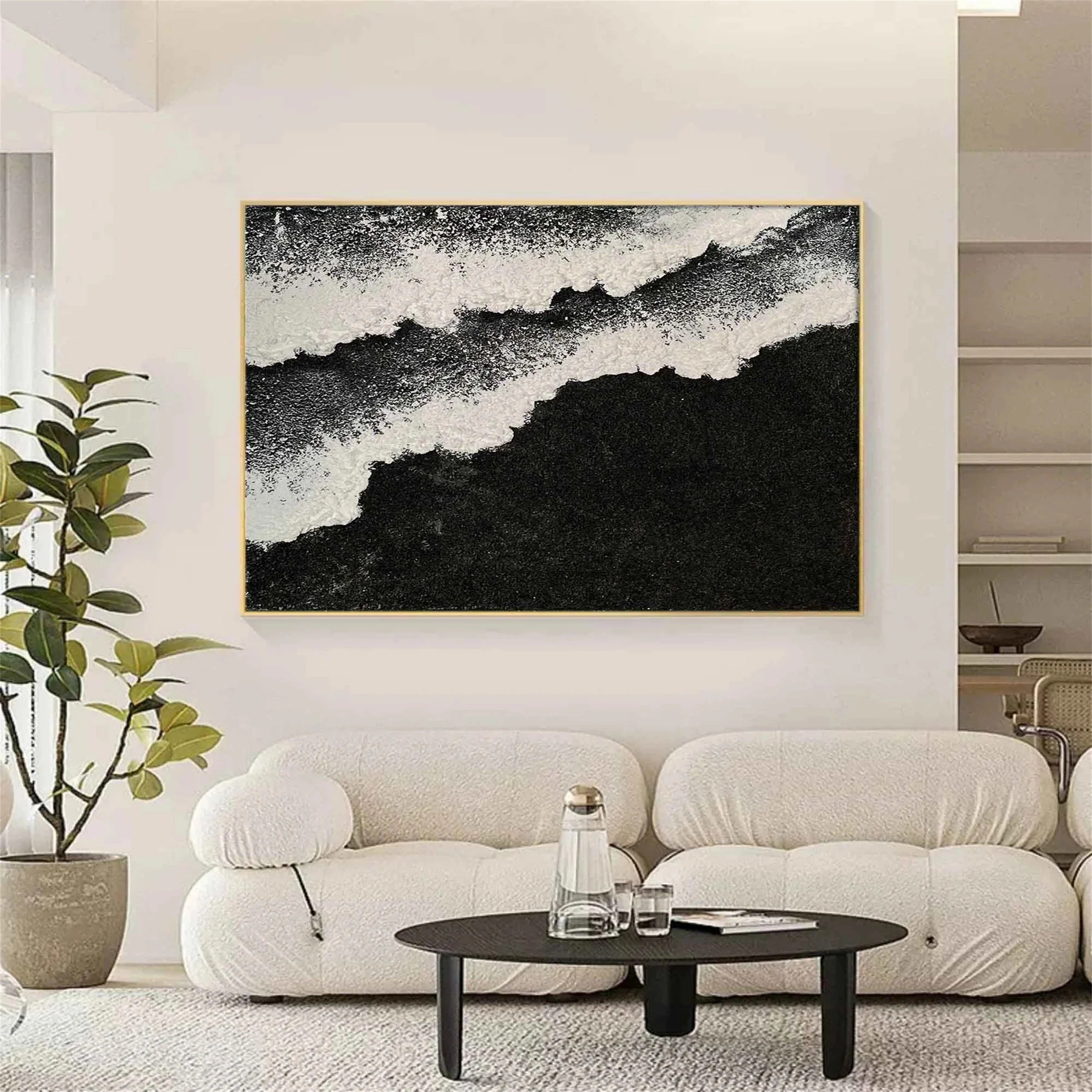
- A single large piece is the simplest and most impactful choice when you want a calm, focused look. It works well above beds or in smaller spaces, and should be at least half the width of the wall or furniture, centered precisely.
- A grid layout creates structure and order. Using identical frames and consistent spacing, it’s ideal for hallways, offices, or modern interiors where a clean, organized look matters.
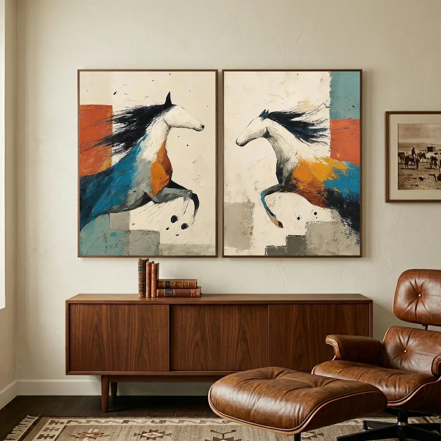
- A gallery wall is more flexible and expressive. It suits larger walls and mixed artwork. Start with a central anchor piece, then build outward while keeping spacing consistent. As Justina Blakeney describes it, the result should feel varied but cohesive—like a skyline.
- A horizontal row is one of the most reliable layouts, especially above sofas, beds, or in long hallways. Aligning pieces in a straight line emphasizes width and creates a clean, balanced look.
- The leaning approach offers a relaxed, flexible alternative. Resting art on the floor, a mantel, or a shelf works well for renters or anyone who likes to update their space often, adding a more casual, layered feel.
Step 4: Use Wall Art to Shape How a Room Feels
Wall art isn’t just decorative—it can subtly change how a room is perceived.
If your ceilings feel low, vertical artwork can draw the eye upward and create the illusion of height. In some cases, placing the center slightly above the standard eye level can enhance this effect.
If a room feels narrow, a horizontal arrangement along the longest wall can visually expand the space. Aligning multiple pieces in a row helps guide the eye across the room.
Large, empty walls often feel cold or overwhelming. A gallery wall can break that space into smaller, more approachable sections, making the room feel more inviting.

Step 5: Work Around Real-World Constraints
In real homes, walls aren’t always ideal. Architectural features often require adjustments.
Above a fireplace, for example, mantels are usually already positioned high. Hanging artwork too far above them can push everything uncomfortably close to the ceiling. In these cases, leaning artwork on the mantel or placing it just slightly above often creates a better balance.
Staircase walls introduce movement, so your arrangement should follow that motion. Instead of aligning pieces horizontally, align their centers along an invisible diagonal that mirrors the stairs.
When dealing with elements like switches or thermostats, it’s usually better to incorporate them into the layout rather than trying to hide them. Leaving intentional space around them often results in a cleaner, more natural composition.

Step 6: Don’t Overlook Lighting
Even a perfectly arranged wall can fall flat without proper lighting. At night, poorly lit artwork can disappear entirely.
The most effective solution is to use dedicated picture lights, which cast a focused, warm glow directly onto the artwork. Adjustable track lighting or directional ceiling spots can also work well if positioned carefully.
Step 7: Test Before You Commit
One of the simplest yet most effective techniques designers use is testing layouts before making anything permanent.
Instead of guessing, create paper templates that match the size of your frames and tape them to the wall. This allows you to experiment with spacing, alignment, and overall composition without committing to nail holes.
Living with the layout for a day or two often reveals adjustments you wouldn’t notice immediately. Once everything feels right, you can hang your artwork with confidence—knowing the placement has already been tested.
How to Arrange Wall Art in Every Room
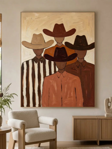
The Living Room: Anchor Above the Sofa
Your art should feel like an extension of the sofa—grounded, balanced, and effortless to look at from both sitting and standing.
Most living room art fails because it floats too high or stretches too narrow. The sofa creates a strong horizontal line. Your art must respect it.
The simple rules:
-
Make the art width about two-thirds of your sofa width. A 72-inch sofa needs art around 48 inches wide.
-
Leave a gap of 6 to 10 inches between the top of the sofa back and the bottom of the frame. Eight inches is the sweet spot.
-
Center the whole composition at 57 to 60 inches from the floor.

Which layout works best? A single large piece is the safest and most elegant choice. If you love your sofa and don't want competition, this is your answer. For longer sofas (over 80 inches), try three matching pieces in a horizontal row or a triptych. Avoid busy gallery walls above seating—they compete with conversation.
Related reading:
How Big Should Wall Art Be Above a Sofa for the Perfect Look?
The Living Room Art Handbook: Your Guide to a Gallery-Worthy Space
The Bedroom: Soften Above the Bed
Your art should help you relax, not energize you. Low contrast, soft tones, and a layout that respects your headboard height.
The biggest mistake in bedrooms is treating the wall like a living room wall. You view bedroom art mostly from lying down, and you wake up to it every morning. It needs to whisper, not shout.
The simple rules:
-
The gap between art and headboard depends on your headboard height. Low headboard (under 30 inches): 6 to 10 inches. Tall headboard (over 42 inches): just 2 to 4 inches—or skip hanging entirely and lean art on the headboard itself.
-
Art width should be 60 to 80 percent of your bed width. A queen bed (60 inches wide) wants art around 42 inches wide.
-
If you have no headboard, hang art 6 to 10 inches above the mattress to create a faux headboard effect with three horizontal pieces.

Which layout works best? A single wide landscape or a triptych (three panels forming one image) is the most restful. Avoid gallery walls—too visually active for sleep. Also avoid faces or high-energy abstract art; they can feel unsettling first thing in the morning.
The Dining Room: Lower Your Eye Level
People sit to eat. Hang your art where they can see it from a seated position.
This is the rule most people get wrong. Standard 57-inch eye level is for standing. In a dining room, seated eye level is closer to 48 inches. Art hung at living room height will feel oddly disconnected above the table.
The simple rules:
-
Center your art at 48 to 54 inches from the floor. Lower for cozier, more intimate dining rooms.
-
If you're hanging above a buffet or sideboard, use the same 6 to 10 inch gap rule as you would above a sofa.
-
Mirrors are a secret weapon. A large mirror above a buffet reflects candlelight, the chandelier, and the people. It's living art that changes with every dinner.

Which layout works best? A single large mirror or a bold single painting works beautifully. For wider buffets, try a symmetrical pair of matching prints or sconces flanking a central piece. Warm-toned art (reds, oranges, golds) actually helps stimulate appetite and conversation.
The Hallway: Create Rhythm, Not Stops
People walk through hallways. They don't stop. Your art should create a sense of movement and rhythm, not demand prolonged attention.
Hallway art fails in two ways: it's either too large (feels like it's lunging at you) or too random (no visual flow). The solution is repetition.
The simple rules:
-
Use a series of similar-sized pieces—same frame, same orientation, related subject matter. Black-and-white photography works beautifully in dim hallway light.
-
Space them closely: 2 to 3 inches apart. In very narrow hallways (under 36 inches wide), go tighter: 1.5 to 2 inches.
-
Center everything at the standard 57 inches from the floor, aligned along a single horizontal line.

Which layout works best? A linear row of 6 to 10 small-to-medium pieces creates a gallery rhythm that pulls you forward. For a short hallway with an end wall, put your single boldest piece on that end wall as a destination.
The Stairwell: Climb With the Angle
Never hang stairwell art level with the floor. It must follow the slope of the stairs.
Stairwells are the most technically challenging wall in any home. Standard horizontal layouts look wrong because you're moving diagonally. The art needs to climb with you.
The simple rules:
-
The centers of your pieces should form an invisible line parallel to your stair angle.
-
Use small to medium pieces (11x14 inches to 16x20 inches). Large frames become disorienting on an angle.
-
Space them tighter than normal: 1.5 to 2 inches, because they're viewed from an angle.
-
Start with the lowest piece at standing eye level (57 inches to center, measured vertically from the floor). Then work your way up following the slope.

How to execute without losing your mind: Use painter's tape and a laser level if you have one. Mark the center points following the stair angle before you hammer a single nail. Hang from bottom to top.
Which layout works best? A climbing gallery wall where pieces get slightly larger as they go up creates a wonderful sense of perspective. Family photo series in identical frames also work beautifully, as do thematic collections like landscapes or botanical prints.
Entryways and console walls : Lean Into Layering
This is where you can break the rules. Lean art directly on the console. Layer pieces. Add objects in front.
Entryways and console walls are shallower (14 to 20 inches deep) than sofa walls, and they're often the first thing people see. They benefit from a more relaxed, collected look.
The simple rules:
-
Art width should be 50 to 70 percent of your console width.
-
Leave a gap of 4 to 8 inches between the console top and the bottom of the frame (closer than a sofa).
-
The standard 57-inch center rule still applies if you hang. But consider leaning instead.

Place a large piece leaning against the wall directly on the console. Then lean a smaller piece against the large piece. Add a small vase, a stack of books, or a sculpture in front. This creates depth on a shallow surface and looks effortlessly curated.
5 Common Mistakes to Avoid
Even with the right pieces and a solid plan, small missteps can undermine your entire arrangement. Here are the five most common mistakes—and exactly how to fix them.
Hanging Art Too High
This is by far the most frequent error. People instinctively hang art at eye level when standing, but they forget that sofas, beds, and consoles sit much lower. The result? Art that floats awkwardly above furniture, disconnected from the room.
Choosing Pieces That Are Too Small
A tiny print on a large wall doesn't look delicate or subtle. It looks lost. This mistake signals hesitation, not intention. Small art needs company; large walls need presence.
Ignoring Spacing Consistency
When hanging multiple pieces, uneven gaps are immediately noticeable. Your eye will detect a 3-inch gap on one side and a 4-inch gap on the other, even if you don't consciously realize it. The result feels sloppy and unplanned.
Overcrowding the Wall
More art does not mean better design. Some walls become so dense with frames that no single piece can breathe. The viewer's eye has nowhere to rest, and the wall feels chaotic rather than curated.
Treating Art as an Afterthought
This is the deepest mistake. Too many people arrange an entire room—sofa, rug, coffee table, pillows—and then, at the very end, look at the blank wall and say, “I should probably put something there.” Art becomes a filler, not a feature.
FAQ
Q: I love gallery walls but worry they’ll look messy. What’s the secret?
A: Use identical frames (all black) and identical mat colors (all white). Keep variety only in the art itself. One variable changes; others stay fixed.
Q: My walls are already a strong color. What art works best?
A: Black-and-white photography or abstract pieces that include that wall color. Avoid high-contrast complementary colors.
Q: Can I mix black-and-white photos with colorful paintings?
A: Yes. Unify them with the same frame color or the same mat style.
Conclusion
Learning how to arrange wall art isn't about memorizing rigid rules—it's about understanding how art interacts with the space around it. Measurements and formulas are useful tools, but they exist to serve a larger purpose: helping you create a room that feels right, not just one that looks correct on paper.
When done right, wall art does not merely decorate your home—it defines it. It becomes the visual thread that ties your colors, your furniture, and your personality into a single, coherent story. And that is something no decorating rule can replace.


Leave a comment
This site is protected by hCaptcha and the hCaptcha Privacy Policy and Terms of Service apply.