

Transforming a house into a home often comes down to the final layer of design: the art on your walls. While furniture provides function, wall art provides the soul. However, staring at a blank white wall can be intimidating, and many homeowners struggle with how to choose the right art for your space so that it resonates with your personality while complementing your existing interior.
This guide breaks down the essential principles of selecting, sizing, and styling art to ensure your space feels curated and cohesive.
5 Essential Rules for Choosing the Perfect Art
Start with the "Vibe" and Color Palette
The most successful rooms use art to either anchor the color scheme or provide a necessary contrast.
- The Harmonious Approach: Look for art that shares at least two dominant colors with your room’s upholstery, rugs, or pillows. This creates a sense of "flow."
- The Contrast Approach: In a room dominated by neutrals (greys, whites, beiges), a vibrant, high-contrast piece of wall art can serve as a powerful focal point that prevents the room from looking "flat."
- The 60-30-10 rule: If your room is 60% neutral and 30% secondary color, let your art represent the final 10% accent color to make the space pop.
Getting the Scale Right
One of the most common decorating mistakes is choosing art that is too small for the wall. A tiny frame on a large wall looks accidental, not intentional.
The Math of Placement:
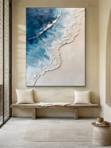
- Over Furniture: If you are hanging a piece over a sofa, headboard, or sideboard, the art should be between 2/3 and 3/4 the width of the furniture.
- The Eye-Level Rule: Center the piece approximately 145cm to 150cm (57 to 60 inches) from the floor. This is the standard gallery height that matches the average human eye level.
|
Space Type |
Recommended Art Size |
|
Above a 3-seater Sofa |
One large horizontal piece (approx. 100cm+ width) |
|
Small Hallway Nook |
A vertical "portrait" orientation or a duo of smaller frames |
|
High-Ceiling Dining Room |
Oversized statement pieces or a tall gallery wall |
Matching Art to Architecture
Your art should speak the same "language" as your home's architecture.
- Modern & Minimalist:For homes with clean lines and open spaces, look for Abstract Expressionism or Line Art. Minimalist wall art with plenty of "negative space" (white background) helps maintain a feeling of airiness.
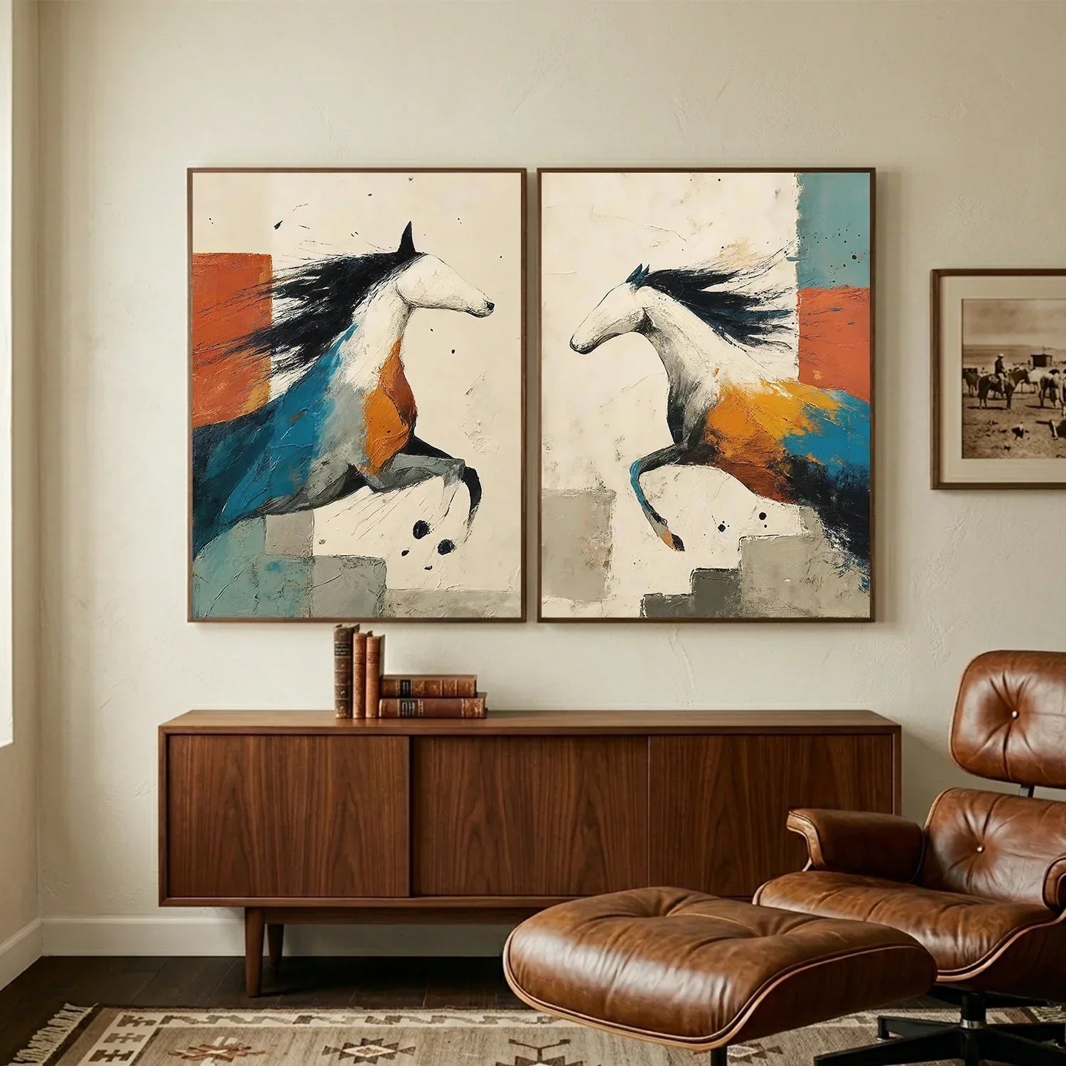
- Mid-Century Modern & Retro:This style pairs beautifully with geometric patterns, Bauhaus-inspired prints, and earthy tones like mustard yellow, olive green, and burnt orange.
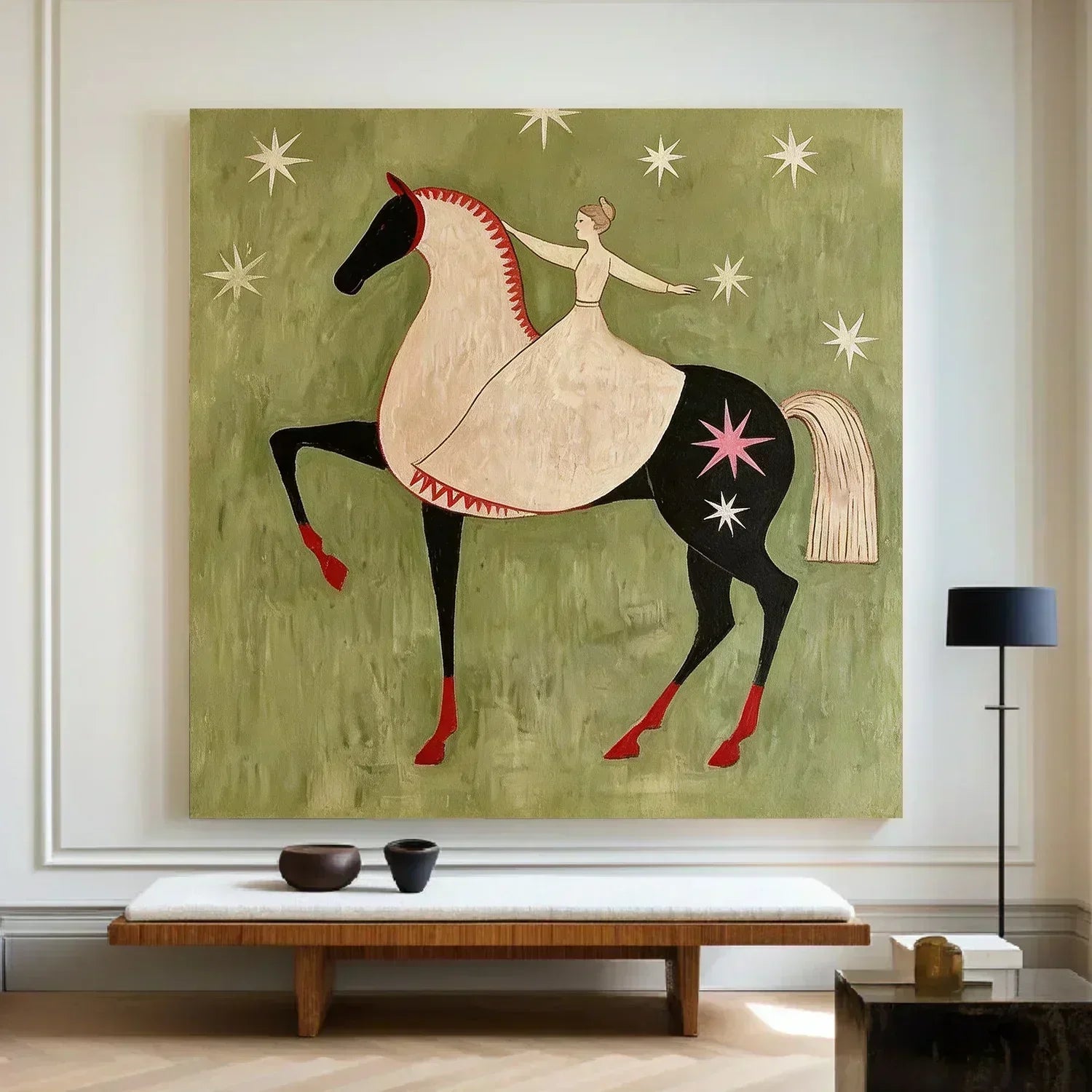
- Classic & Traditional:If your space features crown molding and antique furniture, consider Oil Painting Reproductions, botanical sketches, or classic landscapes. These add a layer of timeless sophistication.
Textures and Materials
Don't limit yourself to paper prints. Exploring different mediums can add depth to your walls:
- Canvas Prints: Great for a sleek, frame-less look that works well in humid environments like kitchens.
- Framed Photography: Provides a crisp, modern finish that adds a personal touch.
- Textile Art: Tapestries or woven hangings provide acoustic benefits, dampening echoes in rooms with hard flooring.

How to Choose Art for Every Space
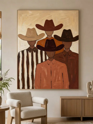
Living Room
where life happens—and the art you choose should help anchor it. Your goal is to create a clear focal point above the sofa or fireplace, drawing the eye and giving the space a sense of purpose.
Take the Johnson family’s open-concept loft as an example:
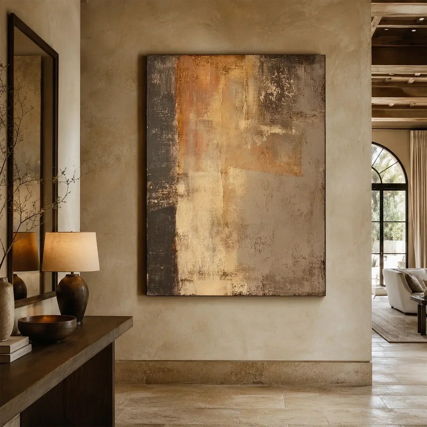
Their living room featured a 10-foot-wide grey sectional against a large white wall, which made the space feel echoey and cold. The solution came in the form of a large-scale abstract canvas . The artwork featured warm terracotta, mustard, and deep teal—colors pulled directly from their vintage rug.The warm tones transformed the grey sofa from a cold design choice into an intentional, inviting centerpiece.

Pro tip : One large, well-chosen piece almost always works better than several small mismatched ones—unless you are intentionally creating a curated salon wall.
Bedroom
The bedroom should promote calm and avoid overly stimulating imagery.
Sarah loved high-energy street art, but it left her too wired to sleep. So she moved it to her home office and chose a soft black-and-white photographic print of misty forest trees (36”x36”) for the bedroom instead. The monochrome palette lowered visual noise, and she paired it with linen bedding in oatmeal and sage for a fully cohesive, restful look.

Pro tip: Hang art slightly lower since you often view it from lying down. In earthquake zones, avoid heavy pieces above the bed—opt for lightweight framed prints or canvas.
Home Office
A well-designed home office should support both concentration and creativity without becoming visually overwhelming.
In Mark’s case, his windowless office with beige walls and no natural light left him feeling unmotivated and mentally drained by mid-afternoon. To address this, he introduced a large-format landscape painting featuring a strong horizon line and a bright blue sky, positioning it directly across from his desk to mimic the feeling of looking out a window. On a side wall, he added a small, structured grid of three minimalist line-art prints to maintain visual interest without clutter. This combination not only visually expanded the space but also brought a sense of openness and calm.

Pro tip: For home offices in general, cooler tones like blues and greens tend to enhance concentration, while warmer shades such as yellow or orange can stimulate creative thinking, and choosing artwork with plenty of negative space helps keep the environment feeling light and uncluttered.
Dining Room
Encourage lingering over meals while avoiding anything too graphic or disturbing.
Take the Chen family’s formal dining room, for example, which, while undeniably elegant, suffered from a sterile aesthetic due to its monochromatic palette of white walls, an oak table, and beige chairs. They managed to bridge this gap by hanging a single, oversized botanical print featuring lush, emerald-and-chartreuse tropical leaves, which introduced a sense of natural vitality that subtly whetted the appetite without overwhelming the space.

Pro tip: Hang art at seated eye level. A mirror can double as art, but avoid placing it directly facing a window (creates glare during dinner).
3 Common Styles & When to Use Them
|
Art Style |
Best For |
Example |
|
Abstract |
Modern/minimalist rooms, high-traffic areas (hides smudges) |
Swirling acrylic canvas in blues & golds |
|
Landscape |
Small rooms (adds depth), relaxation zones |
Watercolor mountain scene |
|
Figurative |
Traditional or eclectic spaces |
Charcoal sketch or impressionist portrait |
Avoid mass-produced “hotel art”—you know the type: wavy lines over a beige background. It’s forgettable. Buy from local artists or print-on-demand sites that offer genuine variety.
How to Visualize Before You Buy
Before hammering a nail into your wall, try these two low-risk methods.
Method 1: The Paper Mockup
- Cut brown craft paper (or newspaper) to the exact size of the art you’re considering
- Tape it to the wall with painter’s tape
- Stand back and observe for 1–2 days
- Adjust size up or down as needed
Method 2: Digital Overlay
- Take a straight-on photo of your room
- Use a free app like ArtPlacer, WallApp, or even basic photo editing
- Paste an image of the wall art onto your wall photo
- See immediately if colors clash or scale is wrong
Q&A
Q: Should I go with one large statement piece or a gallery wall for a small room?
A: While a gallery wall is charming, many small frames can make a tiny room feel cluttered. One oversized, high-quality piece of wall art creates a clean focal point, tricking the eye into thinking the wall—and the room—is larger and more cohesive than it actually is.
Q: How do I mix different art styles without it looking like a mess?
A: The key is to find a "Common Thread."
- Color Palette: Even if the styles differ (e.g., a vintage map next to a modern abstract), sticking to a consistent color story will tie them together.
- Unified Framing: Using the same frame style or color for every piece is a professional trick to make a diverse collection of wall art look intentional and curated rather than random.
Q: Does the art have to match my rug or cushions?
A: Not strictly. If your room is neutral, use your wall art to introduce a completely new accent color. The goal is for the "mood" to match, even if the specific shades aren't a perfect 1:1 match with your rug.
Conclusion
Art is where logic meets intuition. While technical rules help, the right wall art should ultimately reflect your personality and your story. If you’re ready to move from inspiration to installation, mastering how to choose the right art for your space becomes a rewarding creative process.
Eleanos Gallery makes the process seamless. With a curated range of styles designed to fit any aesthetic, we provide the high-quality pieces you need to turn these design tips into a beautiful, finished reality.


Leave a comment
This site is protected by hCaptcha and the hCaptcha Privacy Policy and Terms of Service apply.