

Color is the heartbeat of abstract art. While composition and texture form the body, color is the emotion—the immediate, visceral force that communicates before a single shape is understood. For many, moving from the safety of monochrome or intuitive splashes to a purposeful, harmonious color scheme is the greatest challenge. This guide demystifies that process. We'll translate essential color theory into practical steps, giving you the tools to color abstract art with intention, transforming your work or your space with colorful wall art that truly resonates.

Part 1: What is Color Theory in Art? Your Quick-Start Toolkit
Think of color theory not as a set of rigid rules, but as a language. It's the framework artists use to understand how colors interact, influence each other, and evoke specific feelings. Mastering a few basics is the key to unlocking confident color choices.
The primary tool is the color wheel. Its most valuable lessons for abstract artists are the relationships between hues:
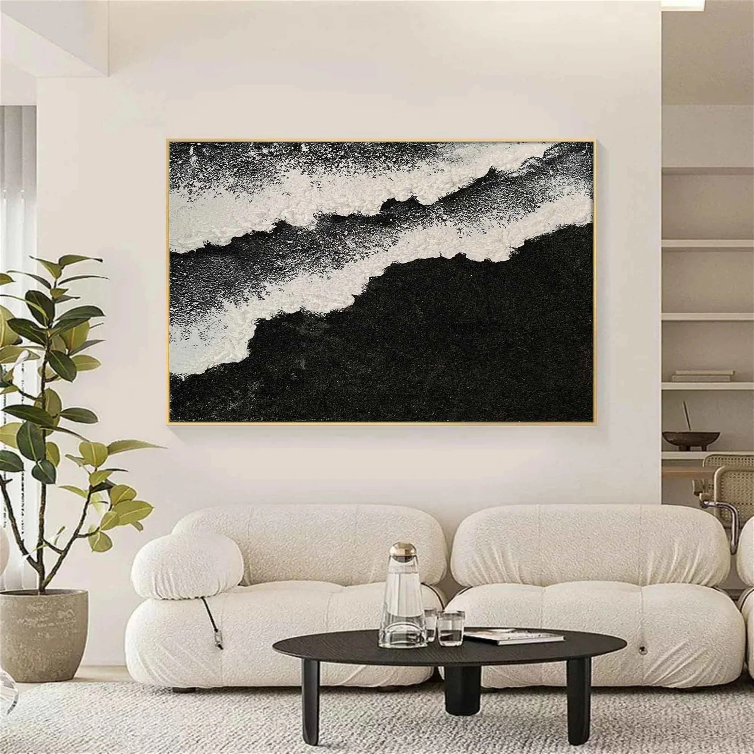
Complementary Colors: Pairs opposite each other (e.g., blue & orange, red & green). This creates maximum contrast and vibrant energy. Used subtly, it adds pop; used boldly, it creates dynamic tension.
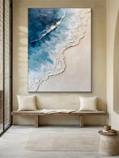
Analogous Colors: Neighbors on the wheel (e.g., yellow, yellow-green, green). This scheme offers harmony, serenity, and a cohesive, natural feel, perfect for creating mood.
Triadic Colors: 3 colors evenly spaced (e.g., red, yellow, blue). This provides rich visual interest while maintaining a strong sense of balance.
Beyond hue, two properties are crucial: Saturation (intensity/purity) and Value (lightness/darkness). A deep, desaturated navy evokes a different feeling than a bright, sky blue, even though they share a "blue" hue. Learning to manipulate these properties is what adds sophistication and depth to colored abstract art.

Part 2: From Theory to Emotion: Decoding the Mood of Colorful Art
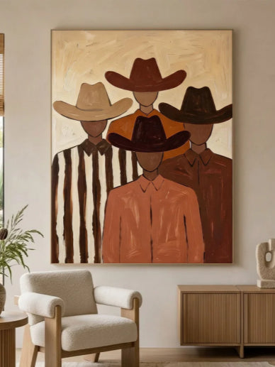
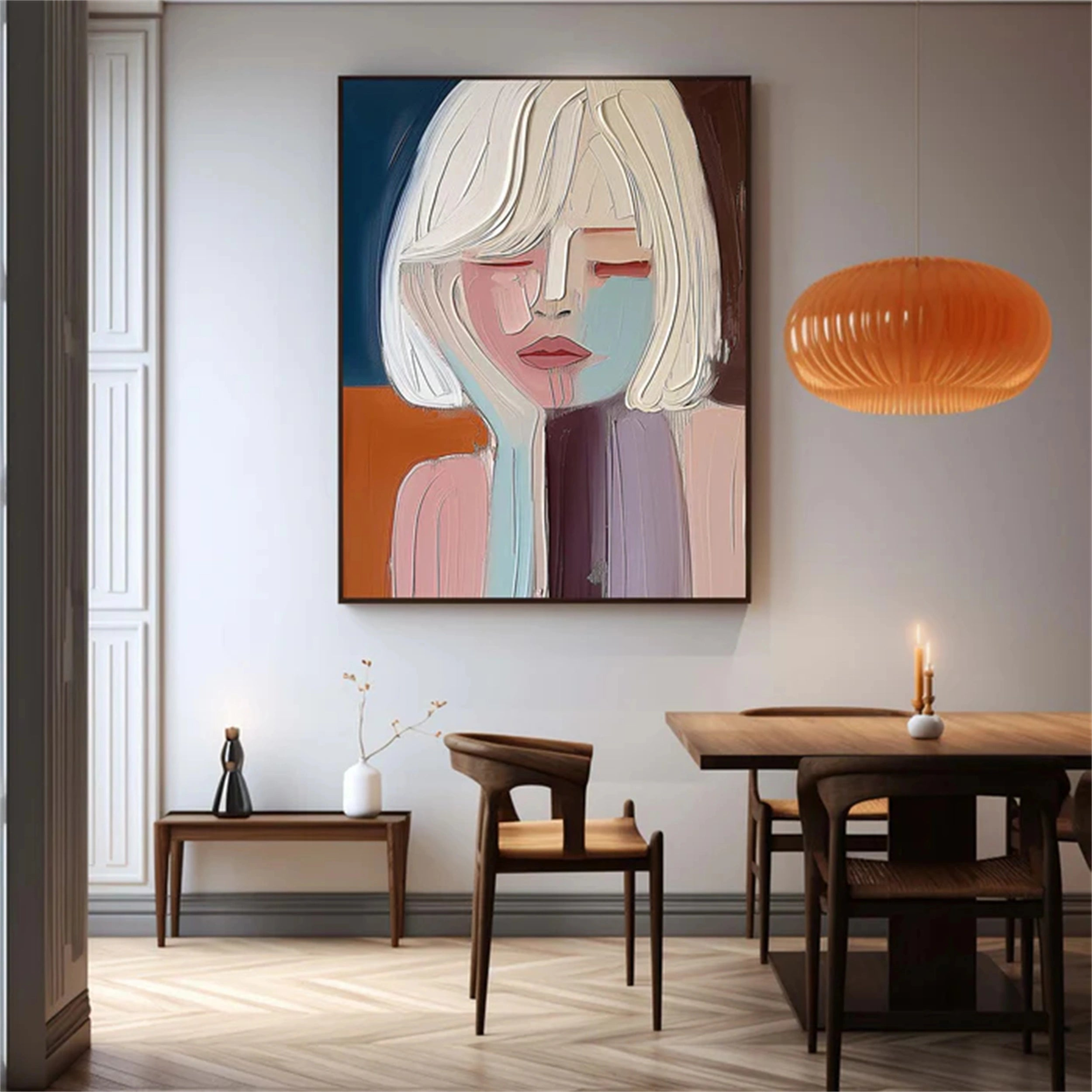
Color theory explains the "how," but emotion is the "why." We use these principles to communicate. A painting using analogous blues and greens might feel calming and immersive, suggesting depth or tranquility—ideal for a space meant for relaxation. In contrast, a piece built on complementary red and green bursts with lively, even urgent, energy, creating a focal point that commands attention.
Understanding this allows you to "read" art more deeply and make intentional choices. Ask: What is the emotional core I want to express or inhabit? Is it joyful energy, meditative peace, or mysterious depth? Your chosen color relationship is the direct path to that feeling.

Part 3: How to Color Abstract Art: Actionable Techniques & Ideas
This is where knowledge becomes practice. Follow this actionable process to build your abstract color palette.
1. Start with an Anchor, Not a Blank Slate.
Facing a white canvas is intimidating. Instead, establish an immediate mood by staining your canvas with a dominant mid-tone wash. Choose a color that reflects your desired emotion—a earthy sienna for warmth, a cool grey for modernity. This foundational layer unifies all subsequent marks and kills the blank page's pressure.
2. Build with the 60-30-10 Rule.
This interior design principle is perfect for structuring abstract color balance.
- 60% - Your Dominant Color: This is the mood-setter, your background or largest fields. Often a muted, desaturated, or mid-value tone.
- 30% - Your Secondary Color: This provides visual interest and supports the dominant. Use a complementary or analogous hue to create a relationship.
- 10% - Your Accent Color: This is the spark. Use a high-saturation, pure version of your complementary color or a metallic. It should be used sparingly in small marks, lines, or edges to create focal points and guide the eye.

3. Create Depth with Temperature and Glazing.
Avoid flatness by playing with warm (reds, oranges, yellows) vs. cool (blues, greens, purples) colors. Warm tones appear to advance, while cool tones recede. Place a warm accent over a cool field to make it "pop." Use glazing—applying thin, transparent layers of color—over existing textures. A blue glaze over a textured white area creates luminous, icy depth; a red glaze over gold evokes warmth.
4. Harmony Through Mixing, Not Just Application.
For truly sophisticated colorful art, mix your own colors. Instead of using tube-made green, mix your blue and yellow. This creates a more natural, harmonious relationship because all colors on the canvas share a common "genetic" material. Limit your palette to 3-4 tube colors plus white; mix everything else. This guarantees cohesion.
5. Test and Iterate Off-Canvas.
Before committing, test your palette on a spare sheet of paper. Paint small swatches of your 60-30-10 colors next to each other. Do they sing? Do they clash? Adjust saturation or value here, not on your nearly-finished painting.

Part 4: Finding Your Colorful Statement: The Bridge to Professional Inspiration
Understanding these principles enriches not only your own creative process but also your appreciation for professional work. You begin to see the deliberate choices behind the emotion—why a particular piece feels energizing or calm. It transforms viewing art from passive looking to active dialogue.
This learned eye makes exploring curated collections a masterclass in application. Platforms like Eleanos Gallery excel in this, offering a practical bridge between theory and masterpiece. Browsing a dedicated collection like their Colorful Art portfolio allows you to see the advanced application of everything discussed: how professional artists balance daring complementary contrasts, build profound depth with glaze and texture, and wield the 60-30-10 rule with expert subtlety. It's an invaluable resource for finding the perfect statement piece that exemplifies the power of intentional color.

Conclusion
Coloring abstract art is a journey from intuition to informed expression. By grounding your choices in the fundamental language of color theory, you gain the confidence to experiment boldly. Remember, the goal is emotional communication. Use the wheel as your guide, the 60-30-10 rule as your structure, and your own sensibility as the final judge. Now, go build a palette that speaks.


Leave a comment
This site is protected by hCaptcha and the hCaptcha Privacy Policy and Terms of Service apply.